brutalist minimalism, stark contrast, matte black, utilitarian (slide 1 of 9)
brutalist minimalism, stark contrast, matte black, utilitarian (slide 2 of 9)
brutalist minimalism, stark contrast, matte black, utilitarian (slide 3 of 9)
brutalist minimalism, stark contrast, matte black, utilitarian (slide 4 of 9)
brutalist minimalism, stark contrast, matte black, utilitarian (slide 5 of 9)
brutalist minimalism, stark contrast, matte black, utilitarian (slide 7 of 9)
brutalist minimalism, stark contrast, matte black, utilitarian (slide 8 of 9)
brutalist minimalism, stark contrast, matte black, utilitarian (slide 9 of 9)
1 / 9

Brand crush

@thebrandidentity

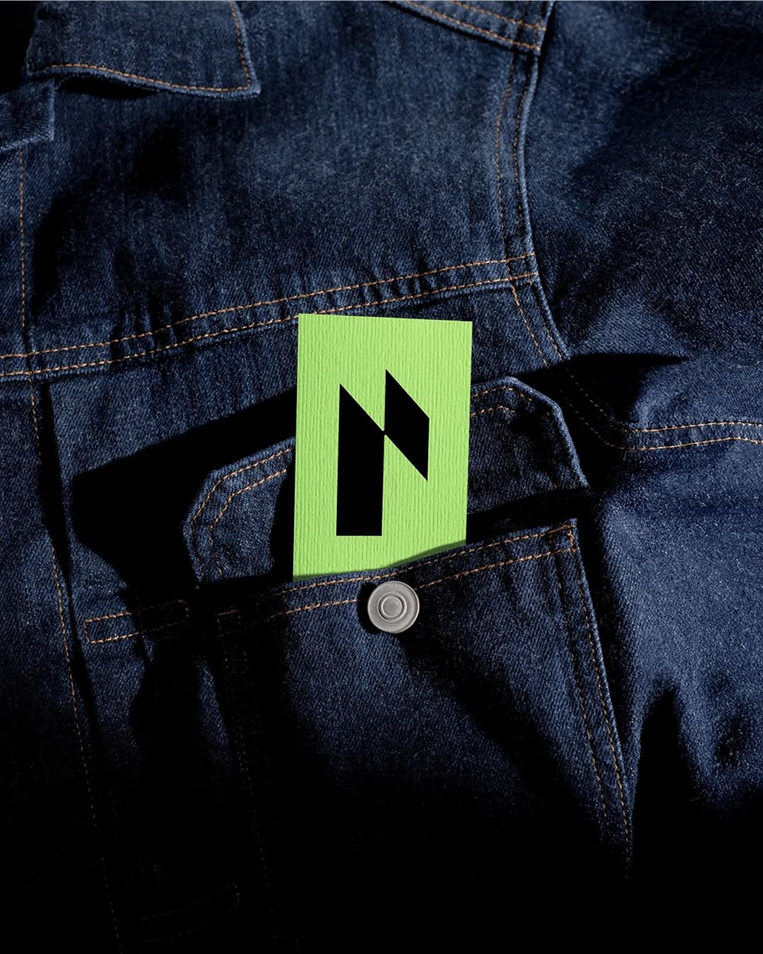
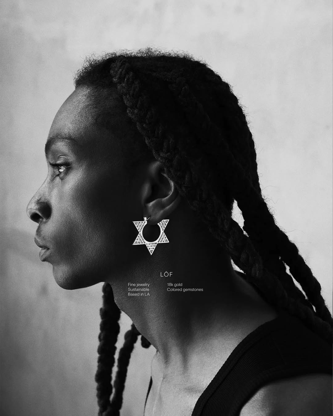
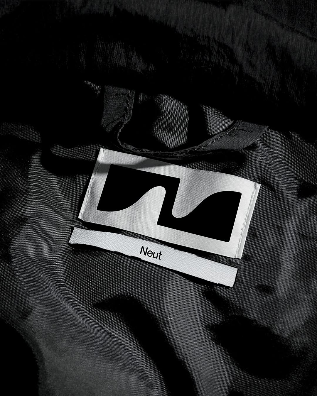
#high-contrast-utilitarianbrutalist minimalism, stark contrast, matte black, utilitarian

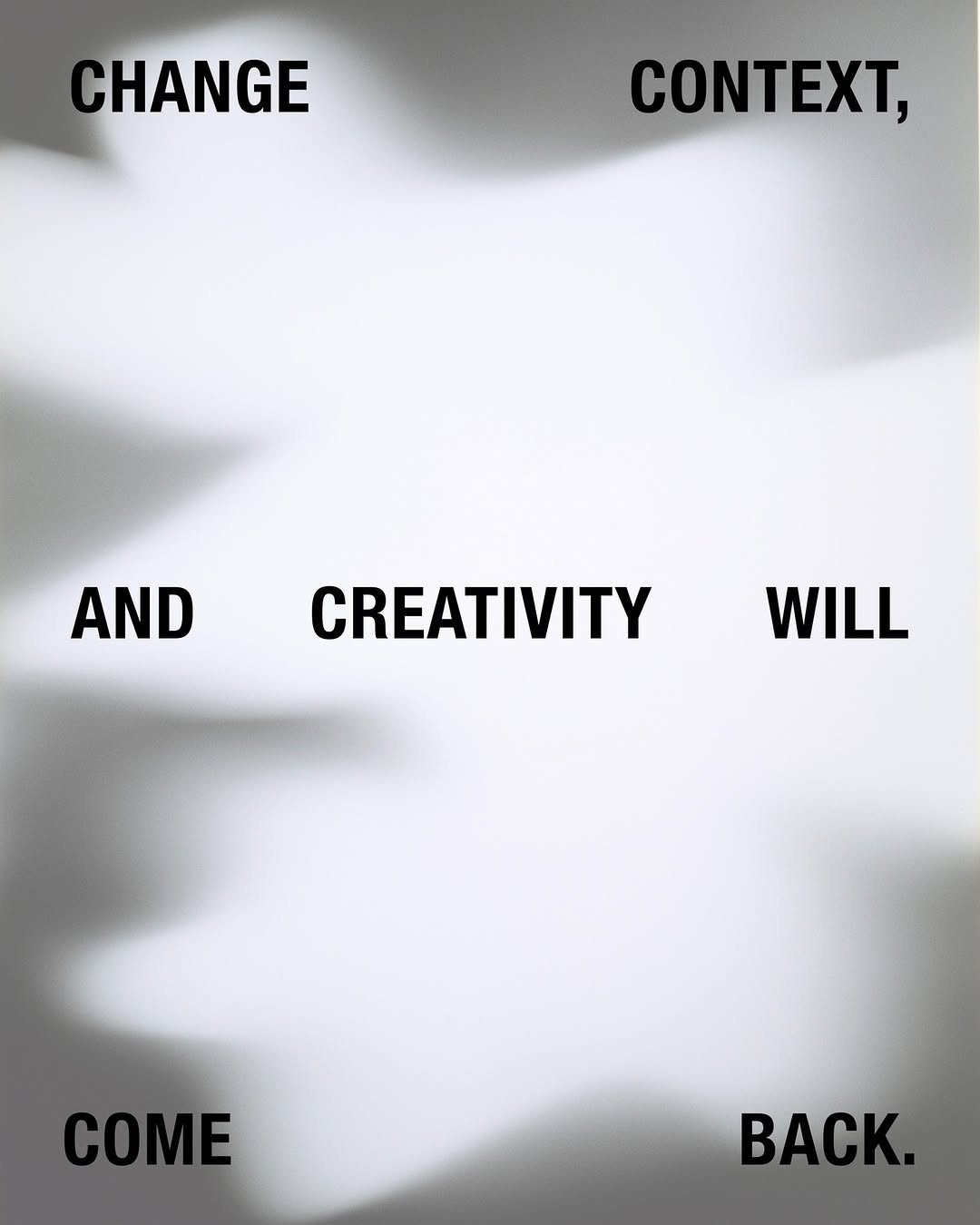
A heavy hit of stark white screenprint on a dense, matte black surface commands a very specific kind of authority. Stripping back the design to a utilitarian grid and high-contrast typography signals absolute confidence in the message over the medium.

The portable idea

Lock down the grid and let the negative space do the heavy lifting. If we run a stark white foil or a dense screen-printed ink across a matte, dark substrate, the brand immediately reads as established rather than loud. Keep the copy strictly functional to sell that brutalist, touring-production aesthetic.

2026年5月20日spotted via @thebrandidentity

Steal this for your brand world

Findie's translation of the move above into specific Sense2 products by industry. Pick the row that fits your brief — pricing is per piece at minimum order quantity.

Three more from the studio

More moments worth a look.

Want something like these?

Ask Findie for a quick conversation, or hand the brief to Susan and the team. Either works.