Brand crush
@sense2lovesbranding
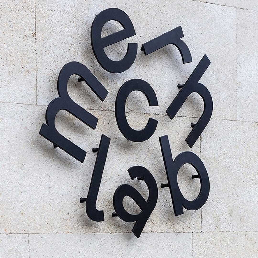
#deconstructed-typographyarchitectural typography, matte black on stone, spatial puzzle
Forcing the viewer to decode a scattered, circular typographic layout turns passive reading into an active cognitive puzzle. By mounting matte black, deconstructed letters on standoff pins, the brand uses shadow and depth to make their name feel architectural rather than transactional.
The portable idea
Building cognitive friction into a layout is a deliberate strategic bet. Disrupting the standard linear logo arrangement and scattering your typography makes the brain work slightly harder, which deepens brand recall. You can replicate this on a smaller scale by treating text as a structural pattern rather than just a label to be read.
2026年5月20日spotted via @sense2lovesbranding