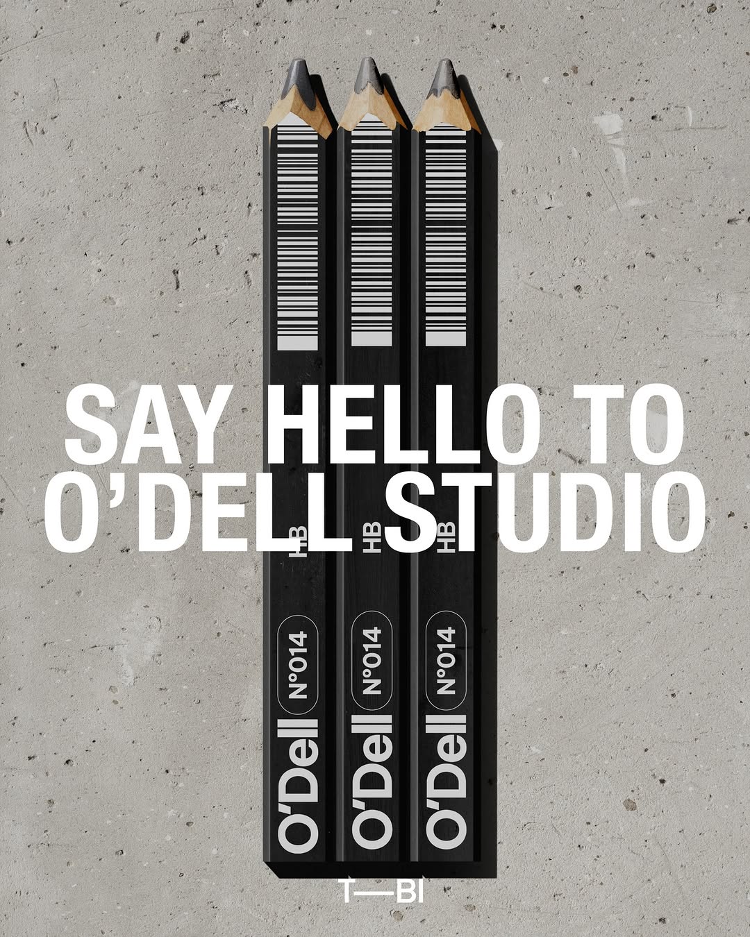
Brand crush
@sense2lovesbranding
#low-fi-interruptioncrisp streetwear, deliberate imperfection, stark contrast
The tension here is between a mass-produced, iconic silhouette and a low-fi, handwritten interruption. Placing the typography on the rubber midsole rather than the leather upper makes it feel like an artist's studio intervention instead of a factory print.
The portable idea
This is about hijacking a clean, familiar canvas with something that looks distinctly human and slightly raw. You do not need a massive print area or a complex logo to get a second look. A handwritten-style font in a single bold PMS colour on a sterile surface does all the heavy lifting.
2026年5月18日spotted via @sense2lovesbranding