Bedrock (slide 1 of 10)
Bedrock (slide 2 of 10)
Bedrock (slide 4 of 10)
Bedrock (slide 6 of 10)
Bedrock (slide 7 of 10)
Bedrock (slide 8 of 10)
Bedrock (slide 9 of 10)
Bedrock (slide 10 of 10)
1 / 10

Brand crush

Bedrock

Identity by thebrandidentity

unexpected-editorial-utilityutilitarian hardware, quiet typography, tonal palette

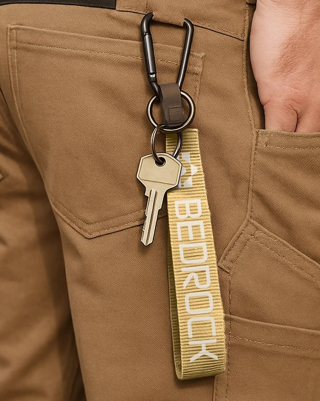
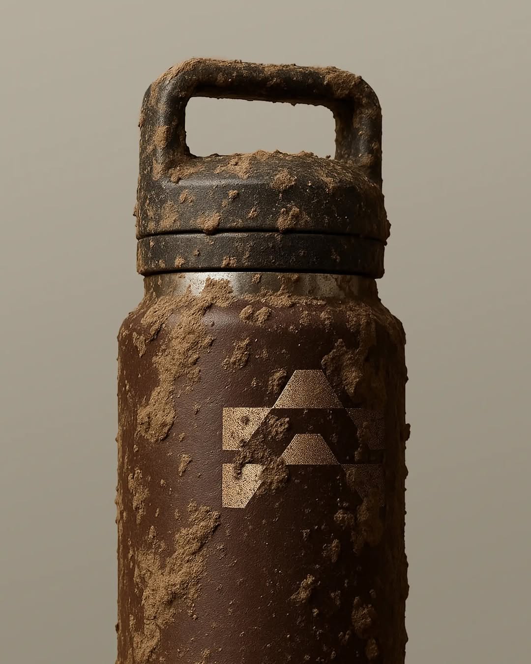
They have taken a rugged, utilitarian object and applied quiet, editorial typography to it. The heavy lifting is done by the contrast between the industrial hardware and the soft, tone-on-tone serif webbing.

The portable idea

You don't need loud colours to brand a tough object. Dropping a refined, well-spaced serif onto an everyday utility item creates a tension that makes people look twice. It turns standard equipment into a quiet statement.

2026年5月20日Brand study
Steal this for your brand world

Findie's translation of the move above into specific Sense2 products by industry. Pick the row that fits your brief — pricing is per piece at minimum order quantity.

This identity lives in our Boutique Hotel aesthetic — The feeling of checking into a beautiful hotel. Warm lighting, thoughtful details and products guests remember.

The Brand Move

Bedrock: editorial type on a rugged object

Part of the boutique hotel aesthetic →

What makes it work

Bedrock takes a rugged, utilitarian object and applies quiet, editorial typography to it, and the whole appeal is the mismatch. The unexpected-editorial-utility move gets its charge from the contrast between industrial hardware and soft tone-on-tone serif webbing. That collision of tough and refined is a very hotel-lobby kind of taste, workwear materials treated with gallery manners. For gifting it argues for pairing genuinely useful, hard-wearing objects with restrained, magazine-grade type rather than bold branding. The tension flatters both. A practical tool that carries elegant typography reads as considered on two levels, and the recipient gets something that's as pleasant to look at as it is to use, which is the whole point of gifting well.

What it signals

Boutique hotel is the aesthetic of considered hospitality — amber light, brass, cream linen, the feeling of being expected. Use it for gifts that should feel like a stay somewhere expensive: client welcomes, settlements, VIP events. It flatters the recipient rather than promoting the sender, which is exactly why it works.

Apply it to merchandise

This move translates naturally to Hotels & venues, Property developers, Private banking & wealth, Law & advisory firms, Airlines (premium cabins), and Wedding & event planners.

Who owns this look

  • Aman & Soho House:the template: monogram restraint, materials over marks
  • Aesop (amenities):the hotel-bathroom flex that upgraded an entire industry's amenity thinking
  • The Hoxton:warm mid-century hospitality branding that travels city to city
  • Halcyon House (Cabarita):Australia's coastal take on boutique-hotel identity

Why it matters now

  • Lightweight luxury

    2026's luxury packaging is shedding weight — premium now means considered materials and closures, not heavy boxes. Perfect for hotel-grade gifting.

  • Refillable prestige

    aluminium and refill systems are the new premium amenity standard — sustainability as a luxury feature, not a compromise.

  • Monogram revival

    quiet-luxury fashion brought back the small woven monogram; hotel-style gifts with initials-not-logos feel personal and expensive.

The psychology

Why we study brands we admire

Great identities are solved problems you get to inherit for free. Every brand crush in this collection made a decision — about material, restraint, colour, voice — that took them years to land. Studying the decision costs you four minutes and skips the years.

Apply the move

Carry this into your own merchandise

These products carry the move natively — each one described by its own product intelligence, the same way Findie reasons about it.

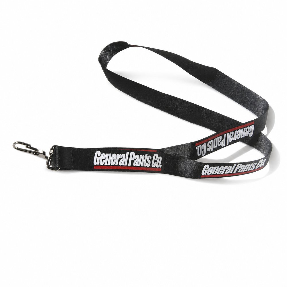
  • Lanyards (Nylon)
    Lanyards (Nylon)from ¥119 税込

    Why it carries the move: a lanyard = the credential made visible — you belong here, you're allowed past the door — woven nylon handles a repeating, tone-on-tone print perfectly without losing the industrial feel.

    A first-day grad → the 9am photo where their staff ID is finally hanging round their neck, and the lanyard colour says they belong.

  • Epoxy Glass Key Chains
    Epoxy Glass Key Chainsfrom ¥155 税込

    Why it carries the move: a key chain = the thing you carry every day that quietly says where you belong — pairing a heavy metal clasp with a quiet resin dome gives that industrial-meets-refined tension.

    New homeowner at settlement → the agent presses the warm keychain into their palm with the actual front-door key already on the ring, and it goes straight on the fridge as the home's first artifact.

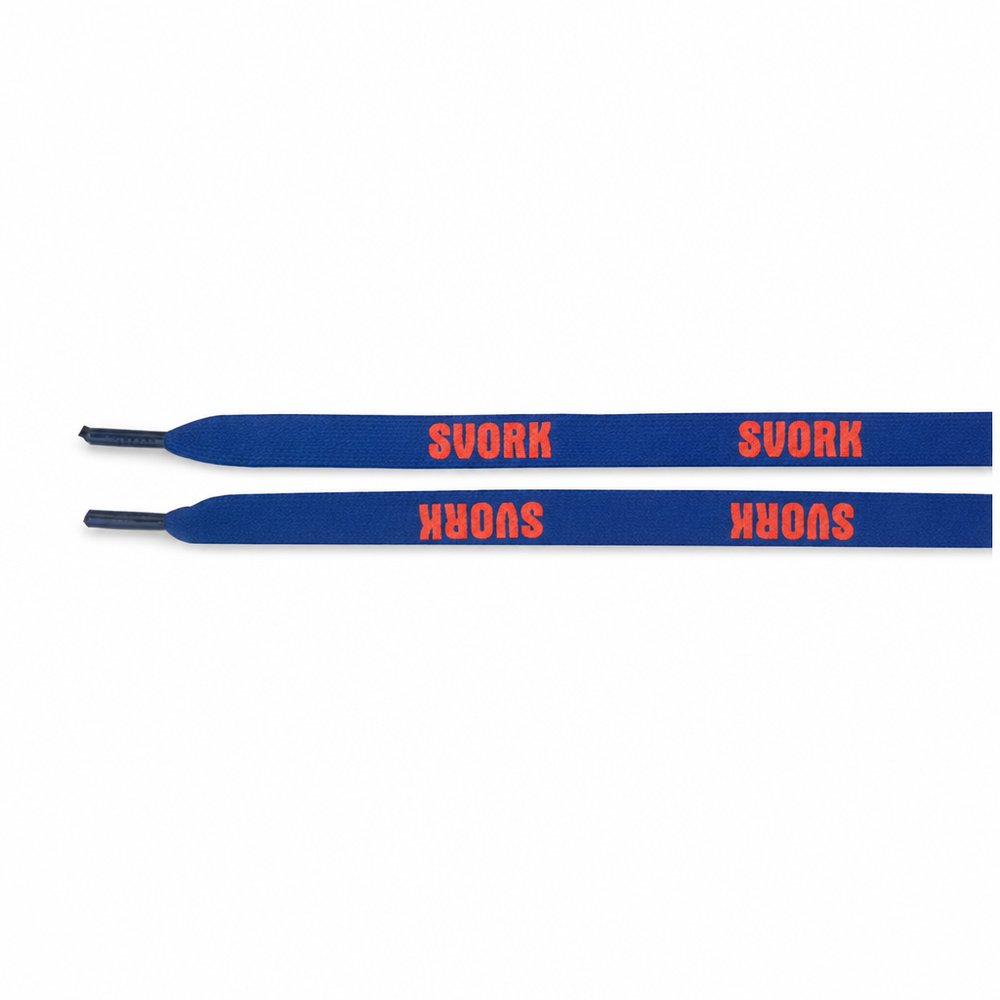
  • PMS Shoe Laces
    PMS Shoe Lacesfrom ¥136 税込

    Why it carries the move: shoe laces = the tie that holds you together for the run, worn into every step you take forward — a subtle, repeating serif on a functional woven lace feels like a streetwear drop rather than corporate swag.

    A first-time parkrun finisher → kneeling at the start line next Saturday, re-lacing in your colour, quietly deciding this is now their team.

Three more from the studio

More moments worth a look.

Want something like these?

Ask Findie for a quick conversation, or hand the brief to Susan and the team. Either works.