
Brand crush
hellowearenature
Identity by hellowearenature
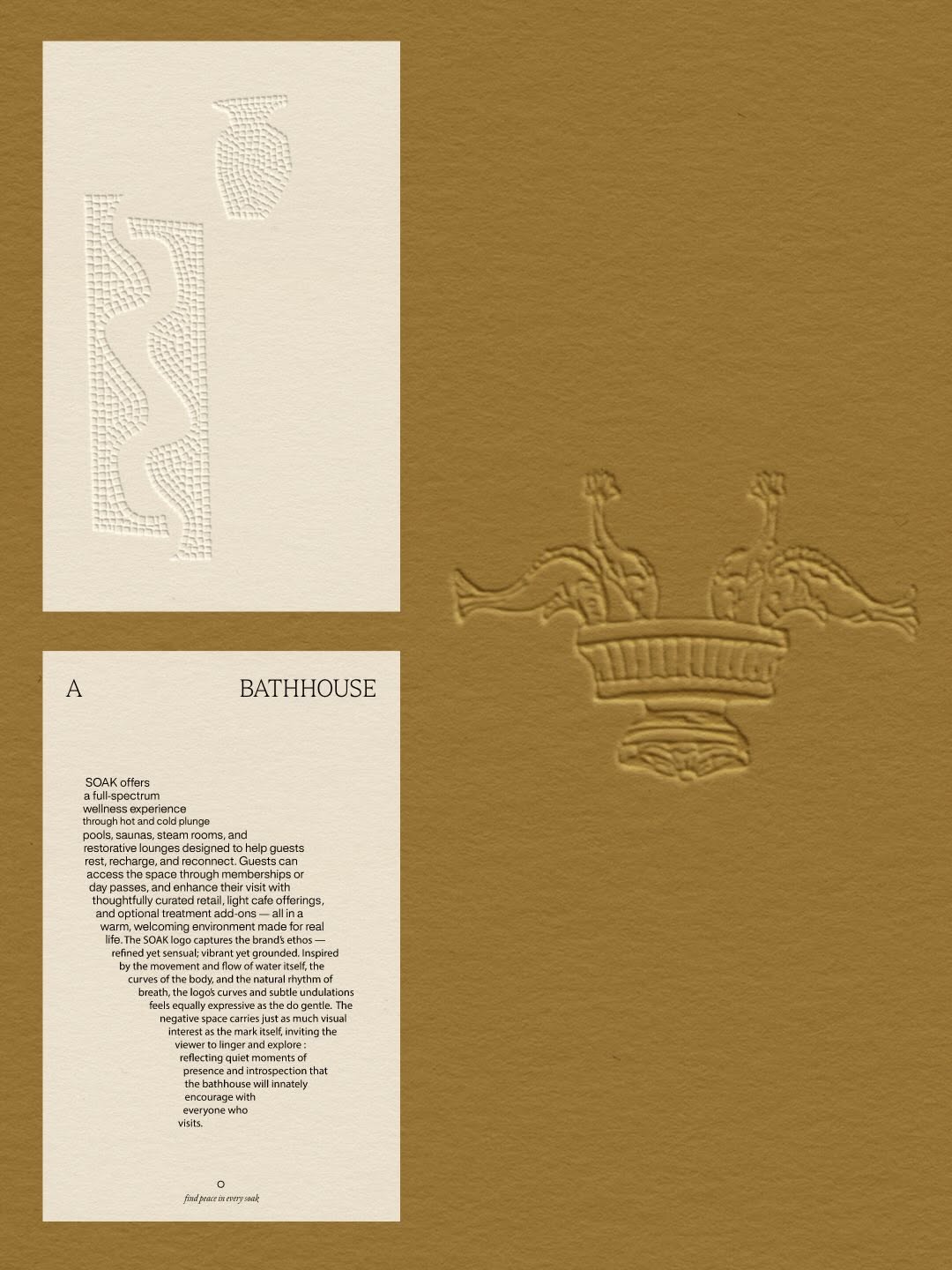
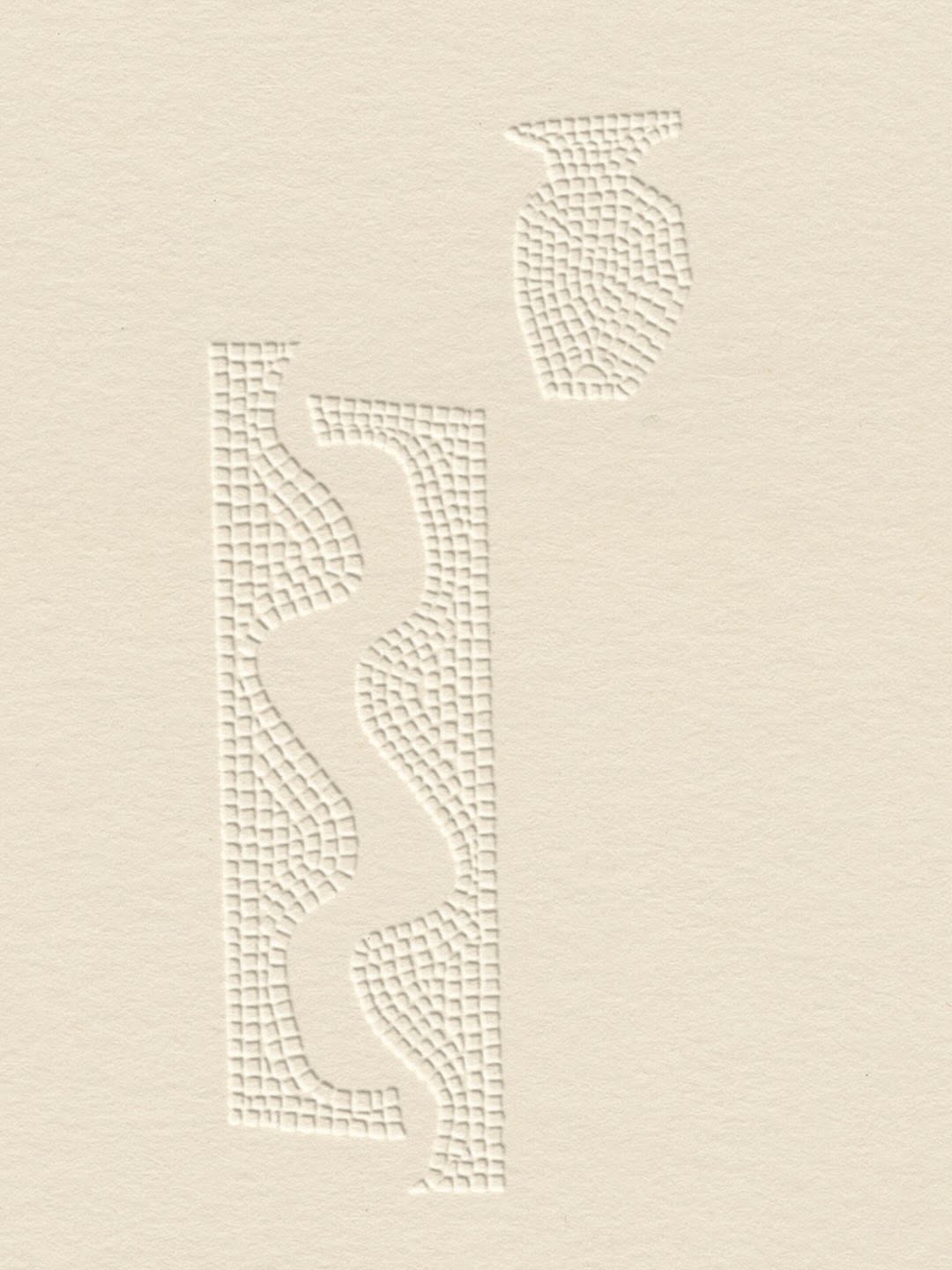
material-first-hierarchytactile terracotta, blind deboss, ancient-meets-modern ritual
That deep blind deboss in the top right corner forces the material to do the talking before you even register the central illustration. The heavy terracotta grain absorbs the light, making the fine linework feel anchored rather than just printed on top.
The portable idea
You can get away with incredibly quiet branding if the substrate has enough character to hold the room. Pushing a logo into a heavy stock without ink creates a shadow-play that makes people run their thumb over it instinctively. We should lean into textures that reward a second glance instead of defaulting to high-contrast prints.
2026年5月26日Brand study