Brand crush
Brand study
Identity by ten.10.design
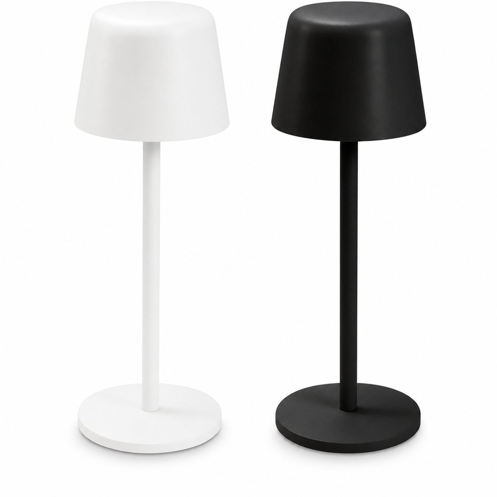
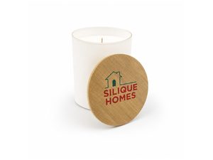
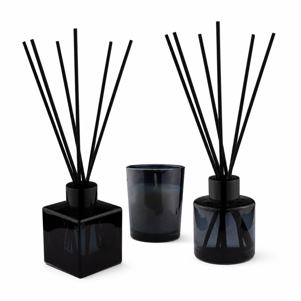
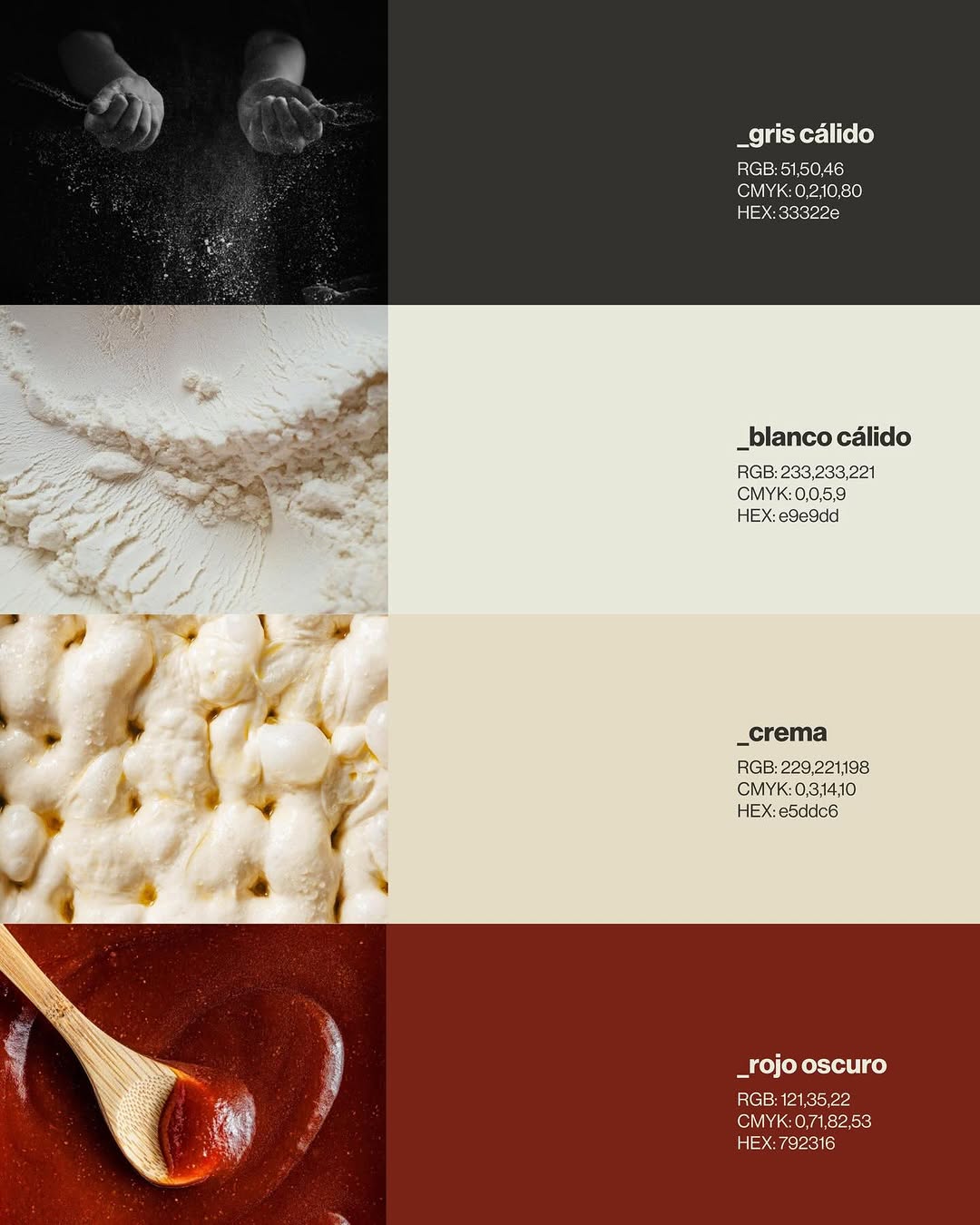
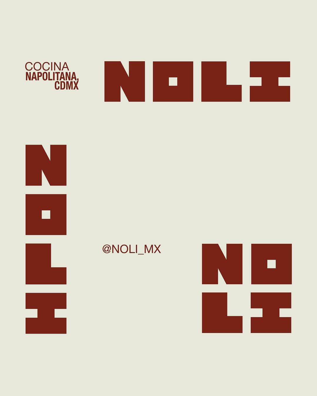
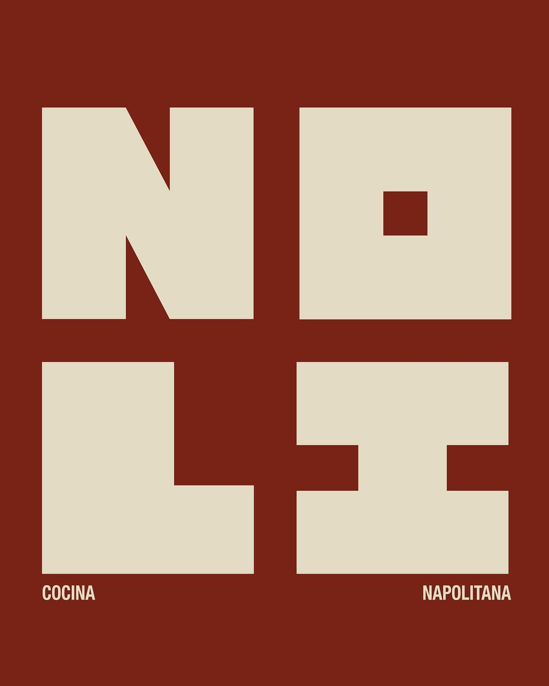
Naming, colours, type, textures and patterns built as one hospitality-grade system — everything speaks softly and matches. The takeaway for boutique-hotel gifting is system thinking: the box, card, tissue and object should feel art-directed together, the way a good hotel's key card matches its bathrobe tag.
2026年5月21日