Brand crush
branding.board
Identity by branding.board
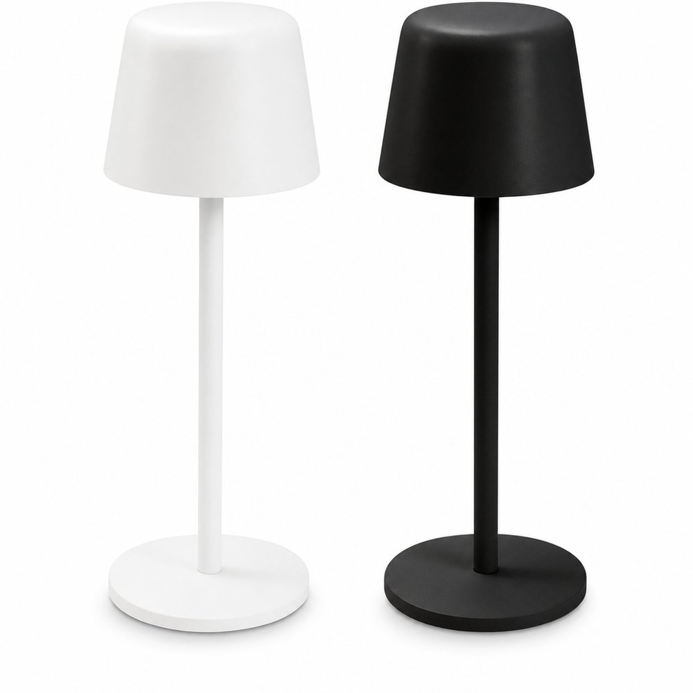
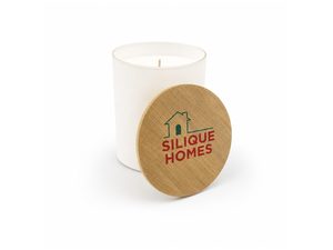
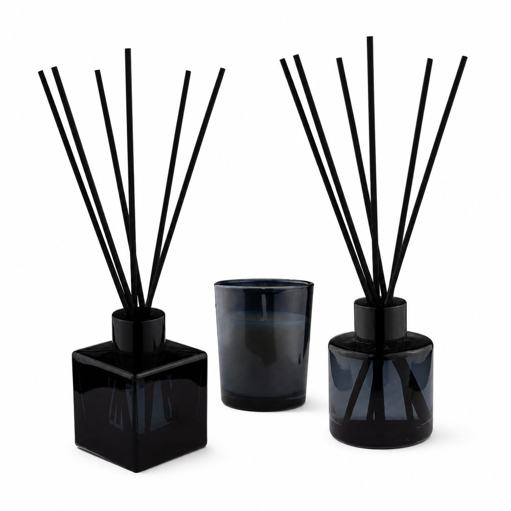
A premium Manuka honey brand that resists every honey cliché — no amber gradients, no hexagons, no bees. The monochrome discipline makes the product feel pharmaceutical-grade, which for wellness is the entire trust battle. Australian brands take note: 'natural' doesn't have to mean 'beige and busy'.
2026年5月28日Brand study