▶ motion

Brand crush

organik_festival

Identity by organik_festival

ambient-typographyambient typographic, forest macro, quiet

Look at the focal blur on the moss and how the crisp, micro-spaced text sits over it to build a silhouette. Using the wordmark as a pointillist texture rather than a standard logo stamp allows the branding to fuse entirely with the physical environment.

The portable idea

See how the individual letters are doing the structural work of an illustration. Treating a wordmark as a raw material—breaking it apart to build shapes or background patterns—lets you brand an object heavily without triggering logo fatigue. It is a quiet way to own the entire surface area.

2026年5月20日Brand study
Steal this for your brand world

Findie's translation of the move above into specific Sense2 products by industry. Pick the row that fits your brief — pricing is per piece at minimum order quantity.

This identity lives in our Boutique Hotel aesthetic — The feeling of checking into a beautiful hotel. Warm lighting, thoughtful details and products guests remember.

The Brand Move

Organik Festival: the wordmark built from its own texture

Part of the boutique hotel aesthetic →

What makes it work

Focal blur on the moss, crisp micro-spaced text resolving into a silhouette above it, Organik Festival uses its wordmark as a pointillist texture rather than a stamped logo. Ambient typography fuses the branding into the environment instead of sitting on top of it. That's a very considered, low-ego way to show up, closer to signage in a well-designed space than an advert. For gifting it points to type that behaves like pattern, a repeated micro-wordmark as a tissue print, a name set small and rhythmic across a wrap. The brand becomes the surface texture, which reads as confident and calm rather than needing to shout its own name.

What it signals

Boutique hotel is the aesthetic of considered hospitality — amber light, brass, cream linen, the feeling of being expected. Use it for gifts that should feel like a stay somewhere expensive: client welcomes, settlements, VIP events. It flatters the recipient rather than promoting the sender, which is exactly why it works.

Apply it to merchandise

This move translates naturally to Hotels & venues, Property developers, Private banking & wealth, Law & advisory firms, Airlines (premium cabins), and Wedding & event planners.

Who owns this look

  • Aman & Soho House:the template: monogram restraint, materials over marks
  • Aesop (amenities):the hotel-bathroom flex that upgraded an entire industry's amenity thinking
  • The Hoxton:warm mid-century hospitality branding that travels city to city
  • Halcyon House (Cabarita):Australia's coastal take on boutique-hotel identity

Why it matters now

  • Lightweight luxury

    2026's luxury packaging is shedding weight — premium now means considered materials and closures, not heavy boxes. Perfect for hotel-grade gifting.

  • Refillable prestige

    aluminium and refill systems are the new premium amenity standard — sustainability as a luxury feature, not a compromise.

  • Monogram revival

    quiet-luxury fashion brought back the small woven monogram; hotel-style gifts with initials-not-logos feel personal and expensive.

The psychology

Why we study brands we admire

Great identities are solved problems you get to inherit for free. Every brand crush in this collection made a decision — about material, restraint, colour, voice — that took them years to land. Studying the decision costs you four minutes and skips the years.

Apply the move

Carry this into your own merchandise

These products carry the move natively — each one described by its own product intelligence, the same way Findie reasons about it.

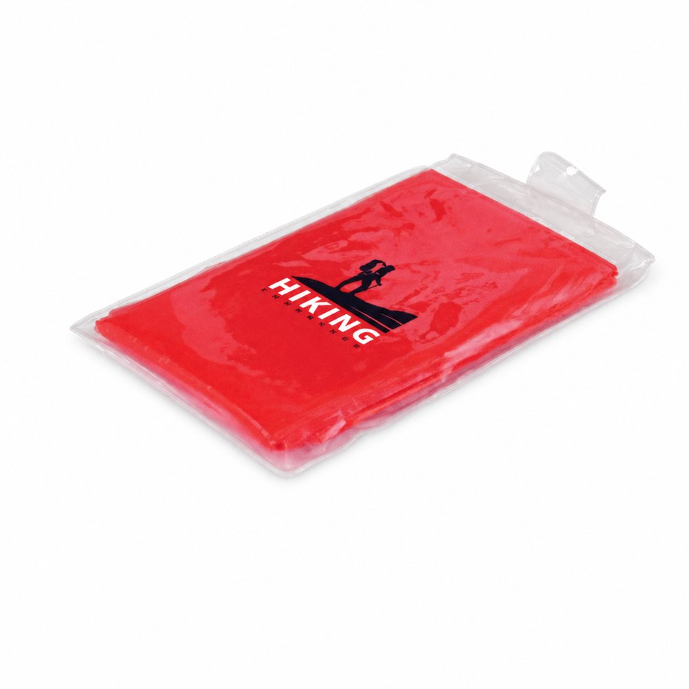
  • Waterproof Hooded Ponchos
    Waterproof Hooded Ponchosfrom ¥239 税込

    Why it carries the move: a poncho = readiness against the unexpected — staying in the moment when the sky turns — print the micro-text pattern across the clear vinyl poncho so it visually overlays the wearer.

    A spectator at a wet outdoor footy final → the moment the sky opens at half-time and they're the only dry person in the stand, quietly grateful instead of soaked and bitter.

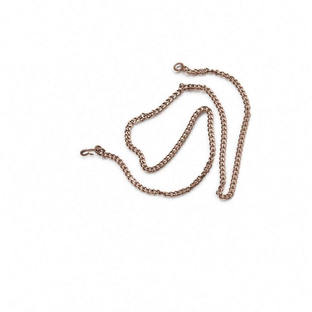
  • Word Shaped Necklaces
    Word Shaped Necklacesfrom ¥316 税込

    Why it carries the move: a word worn at the throat = an identity declared out loud, the thing you choose to be known by — translate the structural type approach into a physical metal piece rather than a printed graphic.

    A spin-class regular hits their 100th ride → the studio clasps a 'STRONGER' necklace on them at the front desk, and they wear it to brunch still flushed from the session.

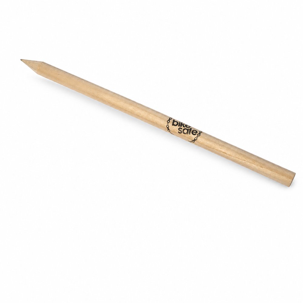
  • Natural Wood Pencils
    Natural Wood Pencilsfrom ¥53 税込

    Why it carries the move: a wooden pencil = the first mark, the raw beginning before anything is committed — potential made holdable — wrap the raw timber barrel in micro-spaced typography instead of a standard block logo.

    A primary student → the first week of term, when a class set of fresh natural pencils gets handed out and every kid does the involuntary sniff-and-sharpen before writing their name on the cover of a new book.

Three more from the studio

More moments worth a look.

Want something like these?

Ask Findie for a quick conversation, or hand the brief to Susan and the team. Either works.