▶ motion

Brand crush

Brand study

Identity by celine

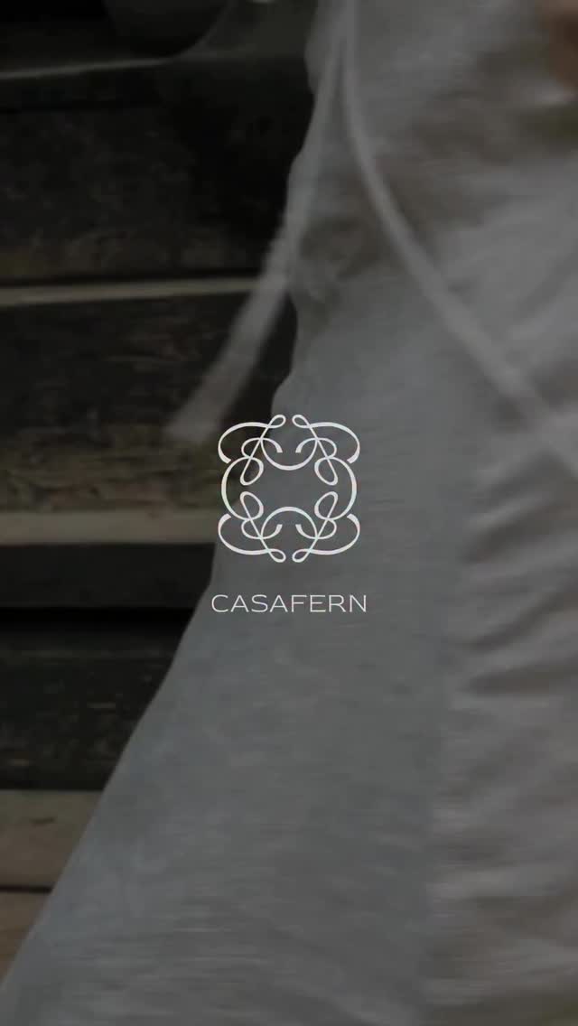
atmosphere-first-brandingcinematic macro-texture, deep aquatic tones, understated

Establishing market authority often means knowing what to leave out. Committing to a singular, immersive macro-texture while reducing the logo to a quietly spaced wordmark builds premium positioning before the audience processes a single rational claim.

The portable idea

The strategic bet here is that an immersive mood bypasses rational friction. Flooding the canvas with a rich, cinematic texture while shrinking the logo forces the viewer to feel the brand rather than read it. It is a confident refusal to over-explain.

2026年5月21日
Steal this for your brand world

Findie's translation of the move above into specific Sense2 products by industry. Pick the row that fits your brief — pricing is per piece at minimum order quantity.

This identity lives in our Boutique Hotel aesthetic — The feeling of checking into a beautiful hotel. Warm lighting, thoughtful details and products guests remember.

The Brand Move

The single-texture bet

Part of the coastal australian aesthetic →

What makes it work

Committing to one immersive macro-texture and shrinking the logo to a quietly-spaced wordmark is a confidence play — it says the brand doesn't need to shout to own the frame. Coastal brands can run the same bet with sand, water or weathered timber as the texture. The lesson: pick your texture like you'd pick a logo, because at this level it IS the logo.

What it signals

The coastal palette is Australia's home-ground advantage — sun-bleached, salt-washed, optimistic. Use it when the brand sells ease: hospitality, summer campaigns, anything that wants to feel like knock-off time on a Friday. It reads instantly Australian to international audiences, which makes it export gold.

Apply it to merchandise

This move translates naturally to Tourism & hotels, Surf & swimwear, Craft beverages, Real estate (coastal), Festivals & events, and Banks & telcos going friendly.

Who owns this look

  • Aesop (Sydney stores):proof the coastal light can be done in muted, architectural tones
  • Vacation Inc.:sunscreen that turned 80s poolside nostalgia into a whole identity
  • Sun Bum:owns beachy yellow so hard the bottle IS the brand
  • Salty Captain:Aussie salt-life branding with high-vis confidence

Why it matters now

  • Pantone 2026: Cloud Dancer

    the colour of the year is a lofty, calming white — sun-bleached coastal palettes are exactly on-trend without chasing it.

  • Place-based authenticity

    2026 packaging juries reward cultural provenance; genuine Australian coastal cues beat generic 'beach' clip-art everywhere.

  • Soft-focus photography

    motion blur and haze (see the surf shot below) are replacing crisp lifestyle photography for mood-first brands.

The psychology

Why we study brands we admire

Great identities are solved problems you get to inherit for free. Every brand crush in this collection made a decision — about material, restraint, colour, voice — that took them years to land. Studying the decision costs you four minutes and skips the years.

Apply the move

Carry this into your own merchandise

These products carry the move natively — each one described by its own product intelligence, the same way Findie reasons about it.

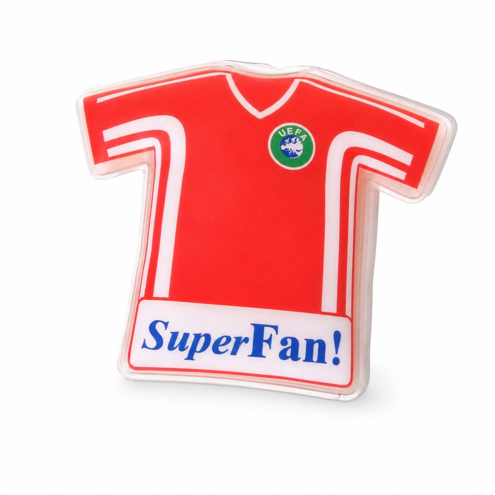
  • Ice Packs Custom Shaped
    Ice Packs Custom Shapedfrom ¥357 税込

    Why it carries the move: an ice pack = relief on demand, the body soothed back from injury or heat — recovery made portable — the gel interior naturally mimics this scattered-light aquatic texture when chilled.

    The weekend footballer → that ice-on-the-ankle moment at 9pm after the match, when your logo is literally the thing easing the pain.

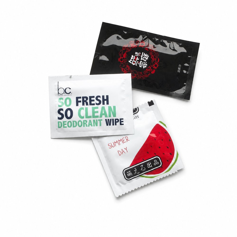
  • Refresher Towel Sachets
    Refresher Towel Sachetsfrom ¥17 税込

    Why it carries the move: a refresher towel = the reset moment — wiping away the mess so you can begin again clean — a full-bleed ocean texture on the foil wrapper turns a functional wipe into a tactile moment.

    A diner mid-way through a messy seafood boil → that exhale of relief when sauce-coated fingers come clean and they reach for the wine without smearing the glass.

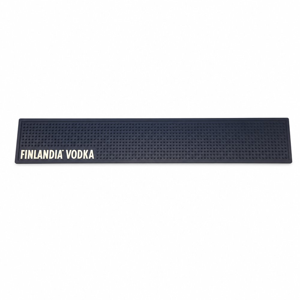
  • Bar Mats (Rubber)
    Bar Mats (Rubber)from ¥1,846 税込

    Why it carries the move: a bar mat = the claimed surface, the place where your name owns the counter where people gather and pour — a dark, heavy canvas that absorbs light and lets a quiet serif wordmark breathe under the glassware.

    A bartender at 1am during a power-dip → the glow print is the only thing they can see, and the brand becomes the thing that kept the pours flowing.

Three more from the studio

More moments worth a look.

Want something like these?

Ask Findie for a quick conversation, or hand the brief to Susan and the team. Either works.