welovebranding (slide 1 of 7)
welovebranding (slide 2 of 7)
welovebranding (slide 3 of 7)
welovebranding (slide 4 of 7)
welovebranding (slide 5 of 7)
welovebranding (slide 6 of 7)
welovebranding (slide 7 of 7)
1 / 7

Brand crush

welovebranding

Identity by welovebranding

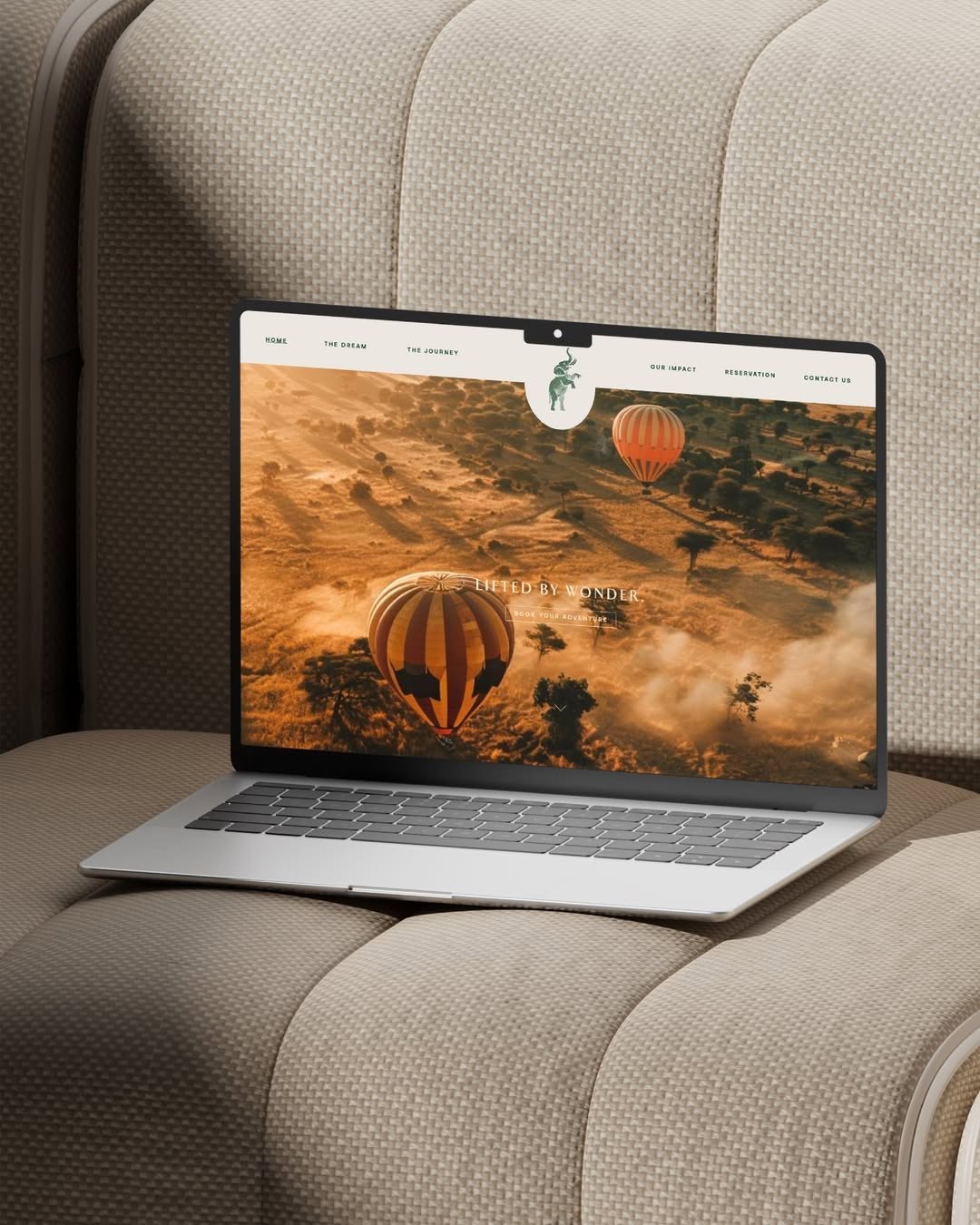
typographic-stillnessnostalgic motion, wide-tracked serifs, earthy quiet

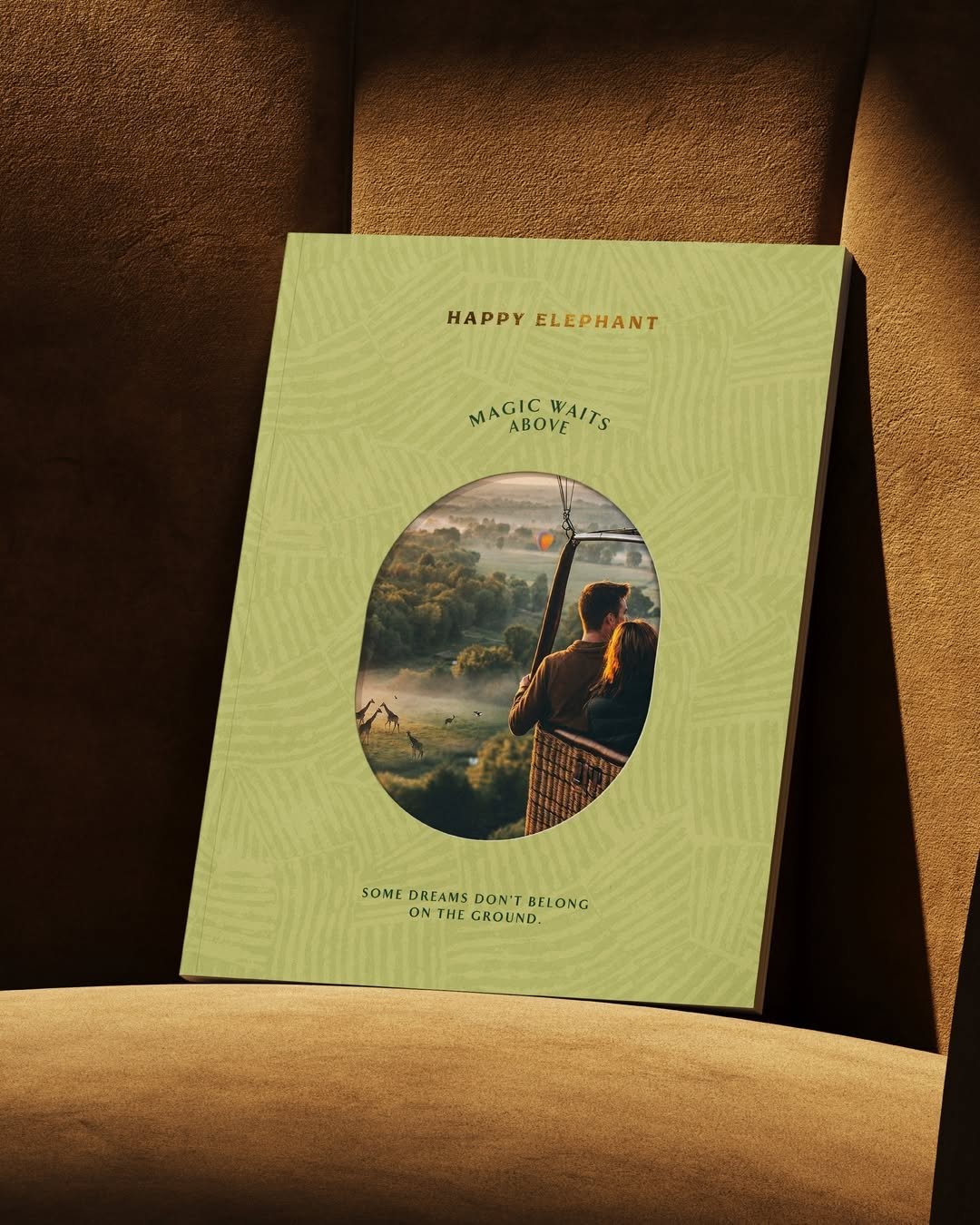
The motion blur on the basket and trees grounds this image in a fleeting moment, while the generously tracked serif typography stays perfectly sharp. Setting quiet, spacious text against an active background creates a tension that makes you stop scrolling.

The portable idea

We usually let a heavy logo do all the structural work. But framing a quiet, widely spaced wordmark against a texture or product with inherent movement gives the brand a sense of permanence. It is a very deliberate way to make a simple piece feel like a memory rather than an advertisement.

2026年5月20日Brand study
Steal this for your brand world

Findie's translation of the move above into specific Sense2 products by industry. Pick the row that fits your brief — pricing is per piece at minimum order quantity.

This identity lives in our Boutique Hotel aesthetic — The feeling of checking into a beautiful hotel. Warm lighting, thoughtful details and products guests remember.

The Brand Move

We Love Branding: sharp type against a blurred moment

Part of the boutique hotel aesthetic →

What makes it work

Motion blur smears the basket and trees into a fleeting instant while generously tracked serifs stay perfectly still and crisp. We Love Branding sets typographic stillness against an active background and the tension does all the work. It's the calm-in-motion feeling a good hotel manufactures, everything moving around you while your corner stays composed. For event and gifting design, this argues for pairing spacious, quiet typography with energetic imagery rather than matching energy to energy. The still element becomes the anchor the eye trusts. Let the world blur and keep the wordmark composed, and the brand reads as the steady hand in the room.

What it signals

Boutique hotel is the aesthetic of considered hospitality — amber light, brass, cream linen, the feeling of being expected. Use it for gifts that should feel like a stay somewhere expensive: client welcomes, settlements, VIP events. It flatters the recipient rather than promoting the sender, which is exactly why it works.

Apply it to merchandise

This move translates naturally to Hotels & venues, Property developers, Private banking & wealth, Law & advisory firms, Airlines (premium cabins), and Wedding & event planners.

Who owns this look

  • Aman & Soho House:the template: monogram restraint, materials over marks
  • Aesop (amenities):the hotel-bathroom flex that upgraded an entire industry's amenity thinking
  • The Hoxton:warm mid-century hospitality branding that travels city to city
  • Halcyon House (Cabarita):Australia's coastal take on boutique-hotel identity

Why it matters now

  • Lightweight luxury

    2026's luxury packaging is shedding weight — premium now means considered materials and closures, not heavy boxes. Perfect for hotel-grade gifting.

  • Refillable prestige

    aluminium and refill systems are the new premium amenity standard — sustainability as a luxury feature, not a compromise.

  • Monogram revival

    quiet-luxury fashion brought back the small woven monogram; hotel-style gifts with initials-not-logos feel personal and expensive.

The psychology

Why we study brands we admire

Great identities are solved problems you get to inherit for free. Every brand crush in this collection made a decision — about material, restraint, colour, voice — that took them years to land. Studying the decision costs you four minutes and skips the years.

Apply the move

Carry this into your own merchandise

These products carry the move natively — each one described by its own product intelligence, the same way Findie reasons about it.

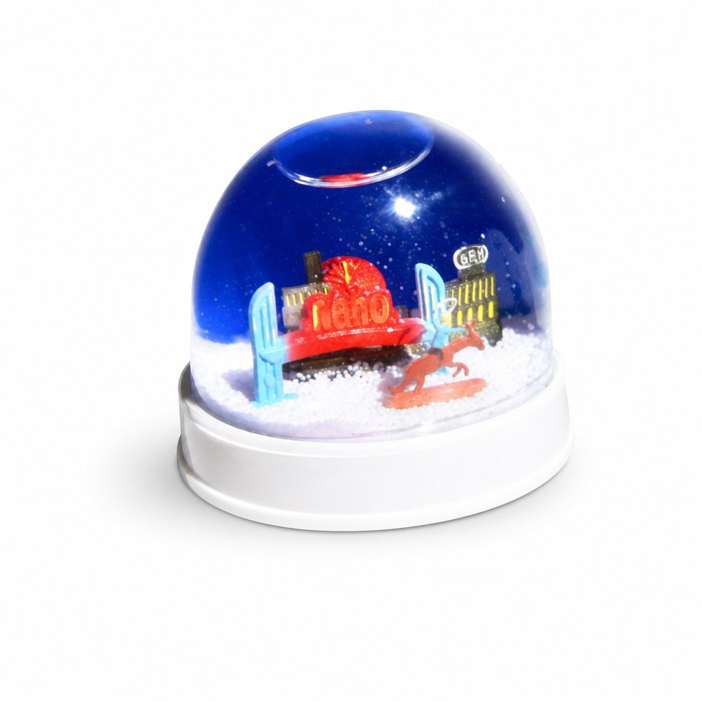
  • Snow Globes (3D)
    Snow Globes (3D)from ¥1,508 税込

    Why it carries the move: a snow globe = a single moment sealed under glass, shaken back to life on demand — enclosing a crisp, static wordmark inside a piece with inherent fluid motion.

    A property investor unboxing it at their office → the half-second they recognise their own development inside and turn it to show whoever's nearest.

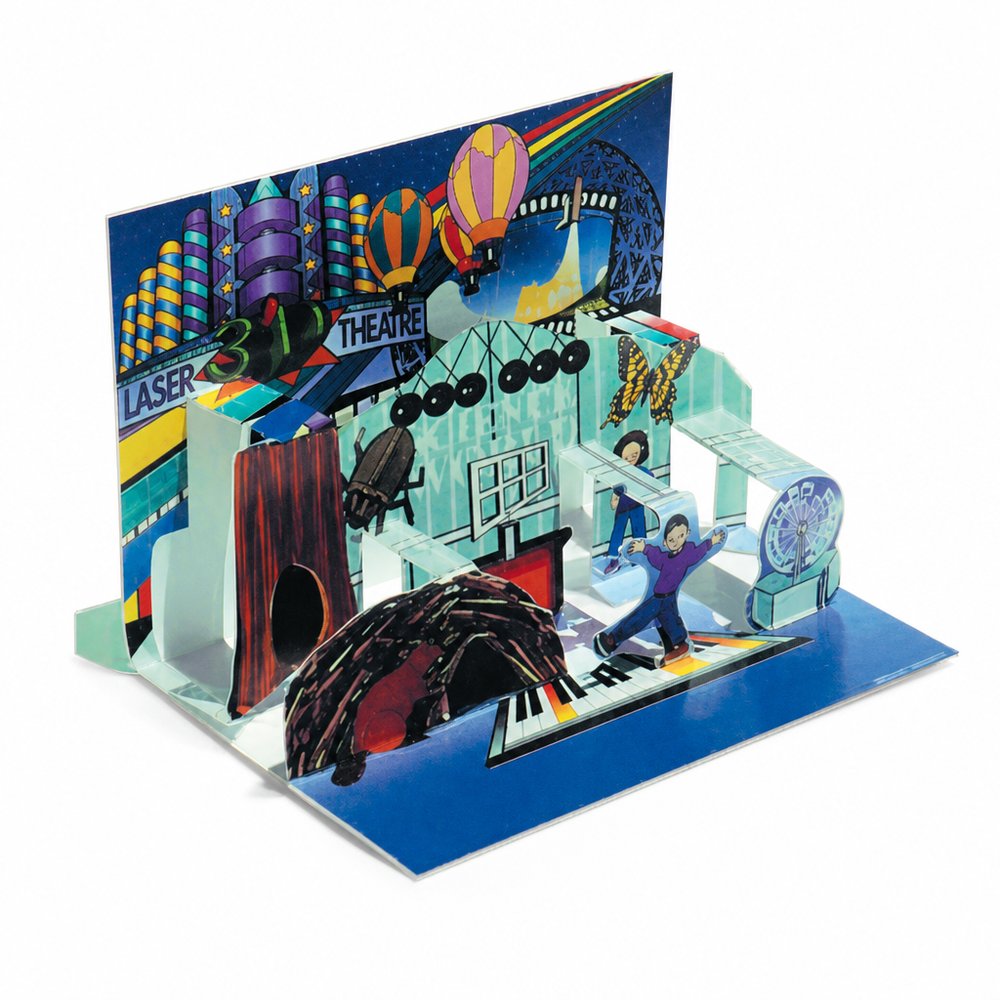
  • Pop Up Postcards
    Pop Up Postcardsfrom ¥239 税込

    Why it carries the move: a flat surface that springs into dimension — the moment a message stands up and announces itself — pairing the structural surprise of a pop-up with deeply tracked, quiet cover text.

    A prospective homebuyer opening the day's mail → the listing rises into a little 3D house on the kitchen bench, and it stays there for a week instead of hitting recycling.

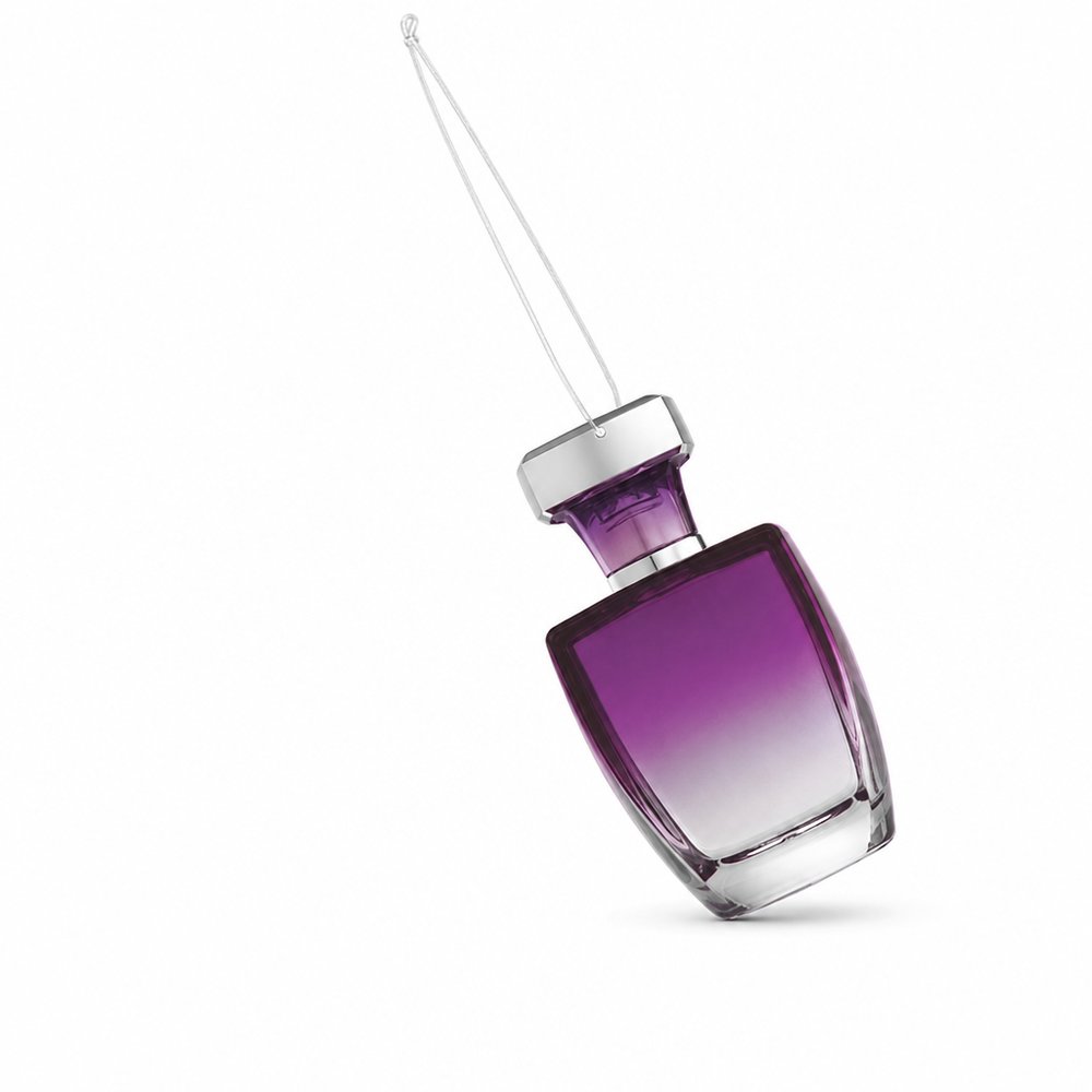
  • Air Fresheners (Custom Scented)
    Air Fresheners (Custom Scented)from ¥147 税込

    Why it carries the move: a scent = an invisible signature, the way a space first announces itself before you see anything — a swinging, suspended piece where generous serif spacing does the heavy lifting.

    New car buyer → that first turn of the key off the lot, when the cabin already smells like 'this is mine now'.

Three more from the studio

More moments worth a look.

Want something like these?

Ask Findie for a quick conversation, or hand the brief to Susan and the team. Either works.