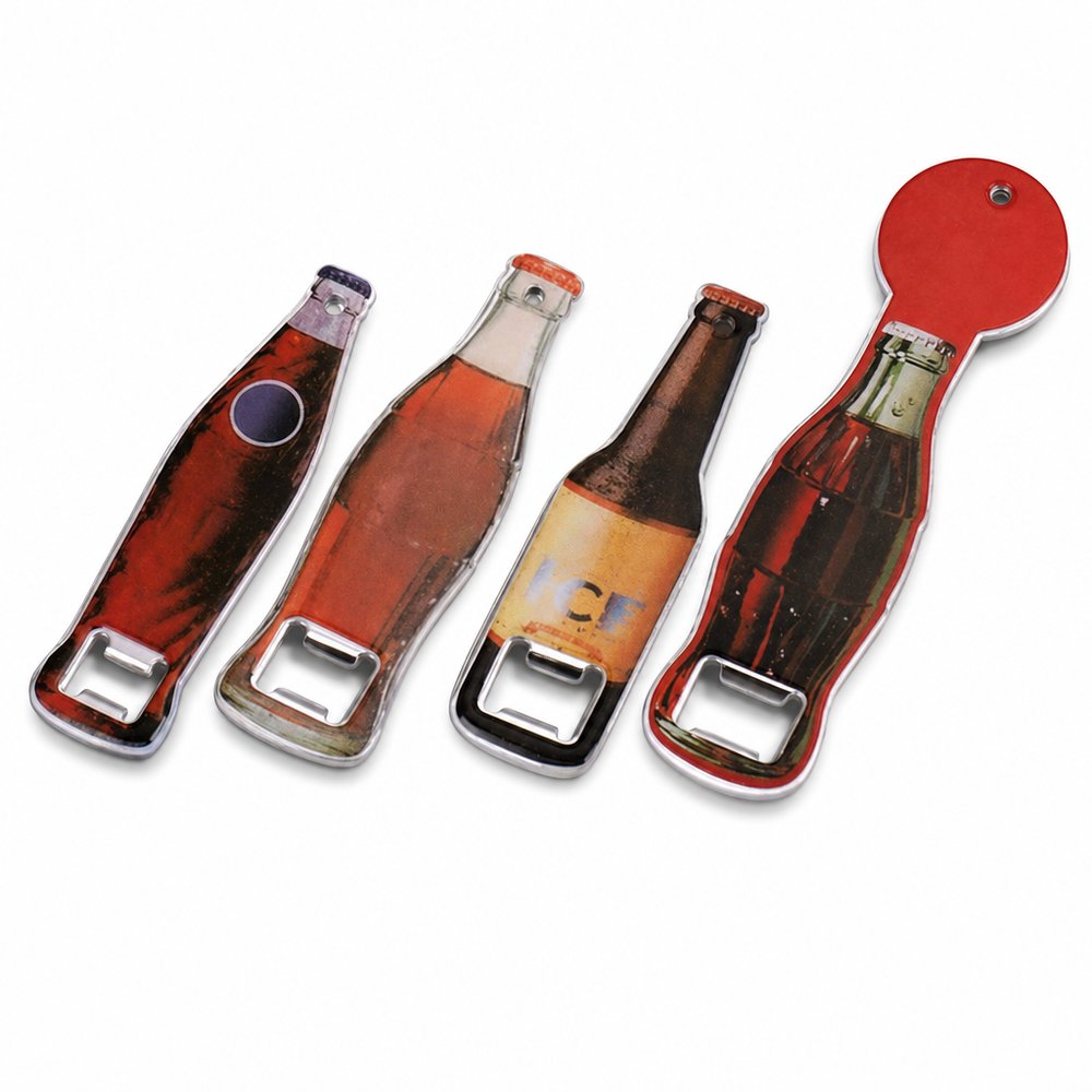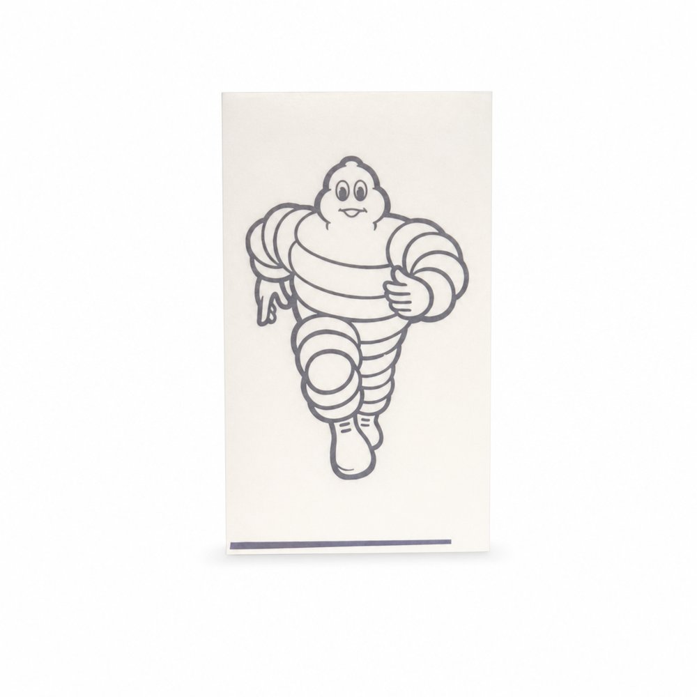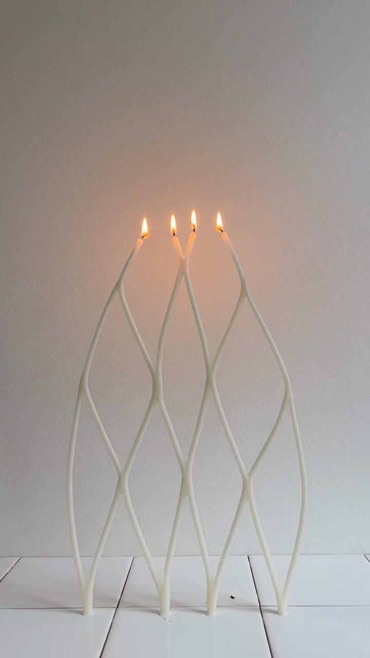
surrealist pop-art, vintage decal typography, brutalist contrast

Brand crush

Brand study

Identity by sense2lovesbranding

modular-decal-layeringsurrealist pop-art, vintage decal typography, brutalist contrast

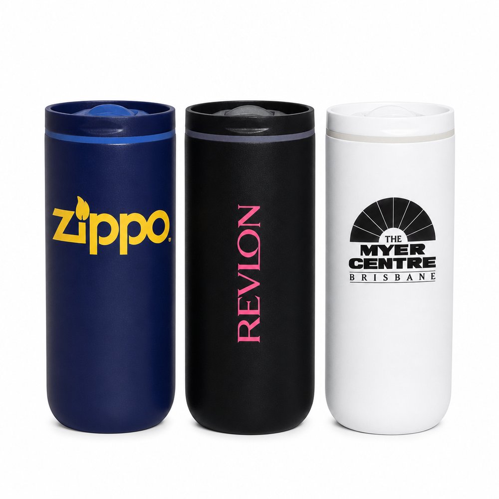
Disrupting visual fatigue requires taking a ubiquitous, organic shape and treating it as a billboard. By layering retro-styled decals against a stark architectural backdrop, this design creates a modular branding system that turns a familiar object into a canvas for micro-narratives.

The portable idea

Shifting the interaction from passive reception to active curation builds significantly higher recall. Instead of printing one static logo on a product, providing a blank canvas alongside a suite of distinct decals gives the end user agency over the final aesthetic. This modular approach turns a basic piece of merchandise into a participatory brand exercise.

2026年5月20日
Steal this for your brand world

Findie's translation of the move above into specific Sense2 products by industry. Pick the row that fits your brief — pricing is per piece at minimum order quantity.

This identity lives in our Bold & Playful aesthetic — Vibrant colours and approachable products that bring energy to events, onboarding and workplace culture.

The Brand Move

Retro decals layered like a system

Part of the bold and playful aesthetic →

What makes it work

This study takes a ubiquitous organic shape and treats it as a billboard, layering retro-styled decals against a stark architectural backdrop to create a modular branding system. Modular-decal layering disrupts visual fatigue by giving the brand a set of interchangeable pieces rather than one fixed mark. That playful, build-it-yourself energy is pure bold-and-playful. It argues for designing a kit of bold decals that combine differently across surfaces instead of locking to a single layout. The variety keeps it lively. When a brand shows up as a system of loud, remixable parts, every application feels fresh, and for playful identities that sense of endless recombination is what keeps an audience looking, because they never quite know what shape the brand will take next.

What it signals

Bold & playful is dopamine as strategy — saturated colour, oversized type, jokes that land. Use it for brands fighting for attention in crowded, young or cause-driven spaces: campus activations, launches, charities, consumer apps. The risk isn't going too far; it's going half-way. Committed maximalism reads as confidence — hedged maximalism reads as a mistake.

Apply it to merchandise

This move translates naturally to Youth & student brands, Streaming & entertainment, Charities & awareness campaigns, Food & beverage challengers, Festivals, and Creative tech.

Who owns this look

  • Who Gives A Crap:Australian toilet paper with more shelf-joy than most fashion brands
  • Duolingo:the owl proved unhinged brand behaviour builds real love
  • Liquid Death:water sold with metal-band energy — category rules exist to be mocked
  • Frank Body:Melbourne's coffee-scrub cheek — playful copy as the identity engine

Why it matters now

  • Anti-AI 'wonky' design

    2026's biggest craft trend — hand-drawn, imperfect, human-signalled design — is bold-and-playful's native language.

  • Artist collaborations

    brands are hiring illustrators for packaging runs (Absolut, Tesco Finest model) — playful identities absorb collabs effortlessly.

  • Sensory maximalism

    textured inks, gloss clashes and colour-drenched unboxings — the reaction against beige minimalism has its own shelf now.

The psychology

Why we study brands we admire

Great identities are solved problems you get to inherit for free. Every brand crush in this collection made a decision — about material, restraint, colour, voice — that took them years to land. Studying the decision costs you four minutes and skips the years.

Apply the move

この発想を自社のノベルティに活かす

これらの商品はその発想をそのまま体現しています。Findieと同じ視点で、各商品の製品インテリジェンスに基づいて説明しています。

  • Stickers Vinyl (78x48mm)
    Stickers Vinyl (78x48mm)from ¥105 税込

    Why it carries the move: a sticker = a claimed surface, a small act of belonging stamped wherever you choose — the exact mechanic for creating collectable, vintage-style fruit labels..

    A uni student → the late-night dorm decision of which sticker is cool enough to make the laptop lid, then defending the choice to a flatmate.

  • Bottle Shaped Bottle Openers
    Bottle Shaped Bottle Openersfrom ¥597 税込

    Why it carries the move: a bottle opener shaped like a bottle = the moment of release, the cap coming off the day, permission to unwind — a familiar silhouette that acts as the blank canvas for your decal system..

    The home-bar enthusiast → that small showing-off second when a guest asks 'where'd you get this?' and they get to tell the brand's story without being asked to.

  • Temporary Tattoos (5x5cm)
    Temporary Tattoos (5x5cm)from ¥5 税込

    Why it carries the move: a temporary mark of belonging — wearing the tribe on your skin for the length of a moment — translates the layered sticker aesthetic directly to the attendee's skin..

    A festival-goer in the bathroom mirror at 7pm → that small thrill of pressing a damp cloth and peeling to reveal a glittering mark, deciding they're officially in for the night.

Three more from the studio

ほかにも、見ておきたい場面が。

Want something like these?

Ask Findie for a quick conversation, or hand the brief to Susan and the team. Either works.