kindergarten unscripted, solid primary colour, honest (slide 1 of 10)
kindergarten unscripted, solid primary colour, honest (slide 3 of 10)
kindergarten unscripted, solid primary colour, honest (slide 4 of 10)
kindergarten unscripted, solid primary colour, honest (slide 5 of 10)
kindergarten unscripted, solid primary colour, honest (slide 7 of 10)
kindergarten unscripted, solid primary colour, honest (slide 9 of 10)
1 / 10

Brand crush

Brand study

Identity by thebrandidentity

radical-imperfectionkindergarten unscripted, solid primary colour, honest

The easiest way to bypass corporate polish is to hand the sharpie to a six-year-old and walk away. The contrast between a flood-coated, neatly folded yellow kraft sleeve and Jolene's wobbly lettering creates instant, unmanufactured charm.

The portable idea

If you want to cut through the noise of perfectly kerned typography, try treating a messy, unpolished scrawl with deadpan high-end production. Taking a childish doodle or a shaky handwritten note and printing it on a heavyweight, serious canvas forces a double take. It proves your brand is confident enough to let its guard down without making a big deal of it.

2026年5月20日
Steal this for your brand world

Findie's translation of the move above into specific Sense2 products by industry. Pick the row that fits your brief — pricing is per piece at minimum order quantity.

The Brand Move

Handing the sharpie to a six-year-old

Part of the sustainable by design aesthetic →

What makes it work

This study bypasses corporate polish by literally handing the lettering to a child, setting Jolene's wobbly hand against a flood-coated, neatly folded yellow kraft sleeve. Radical imperfection creates instant, unmistakable authenticity, the contrast between tidy production and genuine wonk is the whole point. For a sustainable brand that lives or dies on being believed, that honesty is strategic, not cute. It argues for letting real, unpolished human marks onto the packaging rather than smoothing everything into a system. The imperfection is the proof of hand. In a 2026 shelf full of AI-clean gradients, a genuinely human scrawl on honest kraft reads as the most trustworthy thing there, and for eco brands trust is the entire product.

What it signals

Use this aesthetic when sustainability is a claim you can prove — it's the visual language of certification, recycled content and refill systems. In 2026 the greenwash backlash is fully priced in: consumers expect the eco story printed on the object with numbers attached. Design-wise that means honest materials shown raw, single-material construction, and green used as an accent rather than a costume.

Apply it to merchandise

This move translates naturally to B-Corps & social enterprises, Councils & government programs, Universities, Renewables & climate tech, Outdoor & conservation brands, and FMCG refill pioneers.

Who owns this look

  • Patagonia:the benchmark — repair culture and materials honesty as four decades of identity
  • Who Gives A Crap:Australian proof that sustainable can be loud, funny and shelf-dominant
  • Seed Phytonutrients:shower-safe paper bottles that made the material innovation the hero
  • KeepCup:Melbourne-born reuse icon — the product category became the brand

Why it matters now

  • Plastic-free refills & compostables

    2026 Dieline/Pentawards juries put refill systems and compostable films at the top — the aesthetic follows the engineering.

  • Single-material simplification

    mono-material objects (all-aluminium, all-paper) recycle cleanly and photograph honestly — a design constraint that reads as integrity.

  • Storytelling through upcycled materials

    bio-based and waste-stream materials (ocean plastic, coffee husk, wheat straw) carry the narrative physically.

The psychology

Why we study brands we admire

Great identities are solved problems you get to inherit for free. Every brand crush in this collection made a decision — about material, restraint, colour, voice — that took them years to land. Studying the decision costs you four minutes and skips the years.

Apply the move

この発想を自社のノベルティに活かす

これらの商品はその発想をそのまま体現しています。Findieと同じ視点で、各商品の製品インテリジェンスに基づいて説明しています。

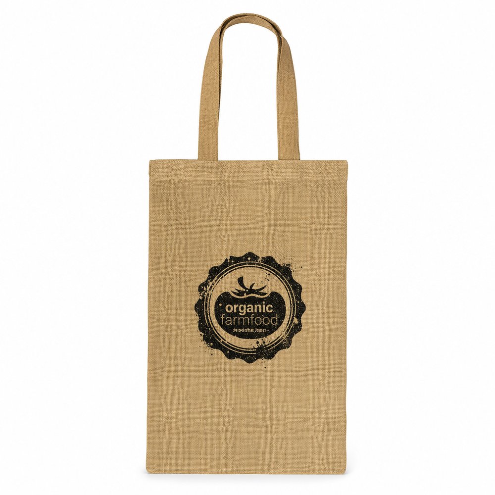
  • Jute Bags (small)
    Jute Bags (small)from ¥422 税込

    Why it carries the move: a jute bag = carrying things forward — the open vessel that says 'take this with you, it has worth' — replaces the standard kraft bag with a reusable, earthy texture that frames wobbly handwriting perfectly.

    A weekend market-goer → reaching for it on the door hook every Saturday morning instead of grabbing a fresh plastic one, the brand riding shotgun on their best routine.

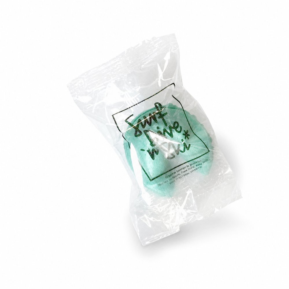
  • Coloured Fortune Cookies
    Coloured Fortune Cookiesfrom ¥147 税込

    Why it carries the move: a sealed fortune cookie = a small promise of what's coming, cracked open on your own terms — slip a handwritten, childish joke inside the wrapper instead of a corporate platitude.

    A new hire at orientation → the small crack-and-read pause that makes a wall of policy slides feel like someone planned a welcome, not a download.

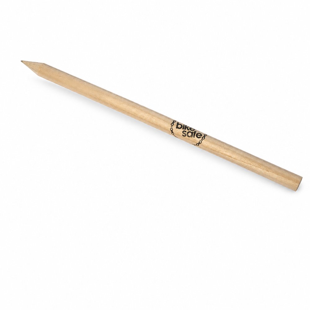
  • Natural Wood Pencils
    Natural Wood Pencilsfrom ¥51 税込

    Why it carries the move: a wooden pencil = the first mark, the raw beginning before anything is committed — potential made holdable — a raw timber canvas for printing actual kids' doodles rather than your studio logo.

    A primary student → the first week of term, when a class set of fresh natural pencils gets handed out and every kid does the involuntary sniff-and-sharpen before writing their name on the cover of a new book.

Three more from the studio

ほかにも、見ておきたい場面が。

Want something like these?

Ask Findie for a quick conversation, or hand the brief to Susan and the team. Either works.