hyper-textured organic backdrop, creamy soft-serif typography, quiet confidence (slide 1 of 9)
hyper-textured organic backdrop, creamy soft-serif typography, quiet confidence (slide 3 of 9)
hyper-textured organic backdrop, creamy soft-serif typography, quiet confidence (slide 4 of 9)
hyper-textured organic backdrop, creamy soft-serif typography, quiet confidence (slide 7 of 9)
1 / 9

Brand crush

Brand study

Identity by clackestudio

polite-type-loud-texturehyper-textured organic backdrop, creamy soft-serif typography, quiet confidence

Treating a dense, chaotic forest like standard wrapping paper is a quiet flex. They dropped a polite, widely tracked wordmark right over all that organic noise, letting the extreme contrast do all the heavy lifting.

The portable idea

If your brand mark is naturally polite, you don't need to make it shout — you just need to put it somewhere noisy. Slapping a soft, widely spaced logo over a hyper-detailed organic pattern forces the eye straight to the negative space of the text. It is the visual equivalent of whispering in a very crowded room.

2026年5月21日
Steal this for your brand world

Findie's translation of the move above into specific Sense2 products by industry. Pick the row that fits your brief — pricing is per piece at minimum order quantity.

This identity lives in our Boutique Hotel aesthetic — The feeling of checking into a beautiful hotel. Warm lighting, thoughtful details and products guests remember.

The Brand Move

The forest as wrapping paper

Part of the sustainable by design aesthetic →

What makes it work

Treating a dense, chaotic forest photograph like standard wrapping paper — then dropping a politely tracked wordmark straight over it — is a quiet flex. It says the brand is comfortable with organic complexity. The transferable move: your sustainability imagery doesn't need taming or tinting; extreme organic texture + disciplined type = credibility.

What it signals

Use this aesthetic when sustainability is a claim you can prove — it's the visual language of certification, recycled content and refill systems. In 2026 the greenwash backlash is fully priced in: consumers expect the eco story printed on the object with numbers attached. Design-wise that means honest materials shown raw, single-material construction, and green used as an accent rather than a costume.

Apply it to merchandise

This move translates naturally to B-Corps & social enterprises, Councils & government programs, Universities, Renewables & climate tech, Outdoor & conservation brands, and FMCG refill pioneers.

Who owns this look

  • Patagonia:the benchmark — repair culture and materials honesty as four decades of identity
  • Who Gives A Crap:Australian proof that sustainable can be loud, funny and shelf-dominant
  • Seed Phytonutrients:shower-safe paper bottles that made the material innovation the hero
  • KeepCup:Melbourne-born reuse icon — the product category became the brand

Why it matters now

  • Plastic-free refills & compostables

    2026 Dieline/Pentawards juries put refill systems and compostable films at the top — the aesthetic follows the engineering.

  • Single-material simplification

    mono-material objects (all-aluminium, all-paper) recycle cleanly and photograph honestly — a design constraint that reads as integrity.

  • Storytelling through upcycled materials

    bio-based and waste-stream materials (ocean plastic, coffee husk, wheat straw) carry the narrative physically.

The psychology

Why we study brands we admire

Great identities are solved problems you get to inherit for free. Every brand crush in this collection made a decision — about material, restraint, colour, voice — that took them years to land. Studying the decision costs you four minutes and skips the years.

Apply the move

Carry this into your own merchandise

These products carry the move natively — each one described by its own product intelligence, the same way Findie reasons about it.

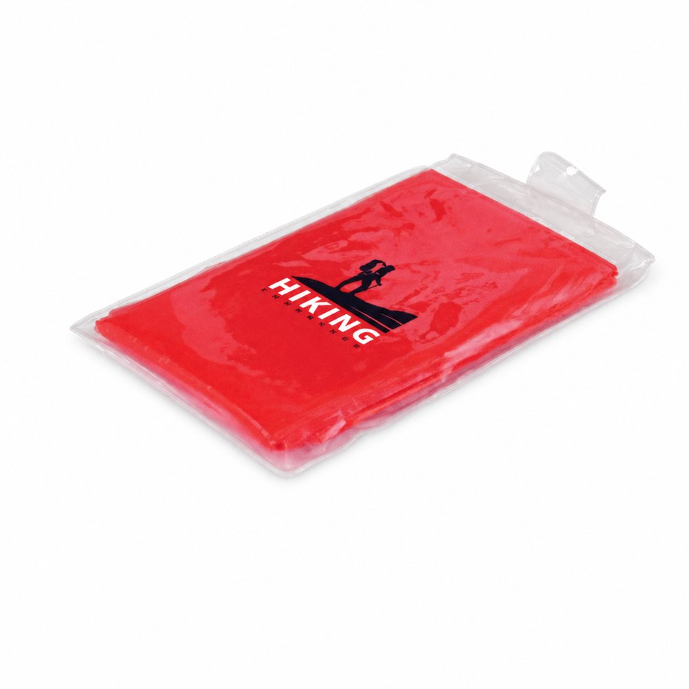
  • Waterproof Hooded Ponchos
    Waterproof Hooded Ponchosfrom ¥239 税込

    Why it carries the move: a poncho = readiness against the unexpected — staying in the moment when the sky turns — printing a stark, cream wordmark across a dark forest-green canopy to let the scale do the talking.

    A spectator at a wet outdoor footy final → the moment the sky opens at half-time and they're the only dry person in the stand, quietly grateful instead of soaked and bitter.

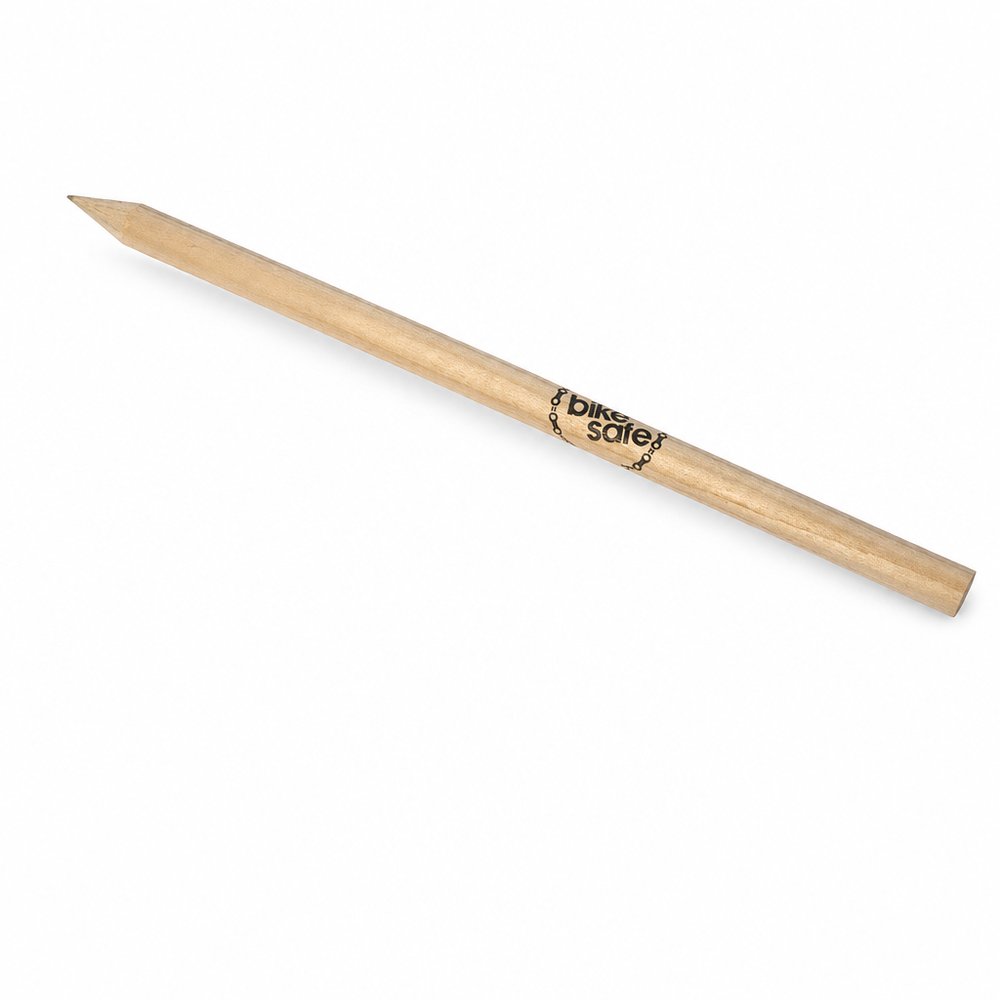
  • Natural Wood Pencils
    Natural Wood Pencilsfrom ¥53 税込

    Why it carries the move: a wooden pencil = the first mark, the raw beginning before anything is committed — potential made holdable — letting the raw, chaotic wood grain act as the noisy backdrop for a clean, tightly spaced foil stamp.

    A primary student → the first week of term, when a class set of fresh natural pencils gets handed out and every kid does the involuntary sniff-and-sharpen before writing their name on the cover of a new book.

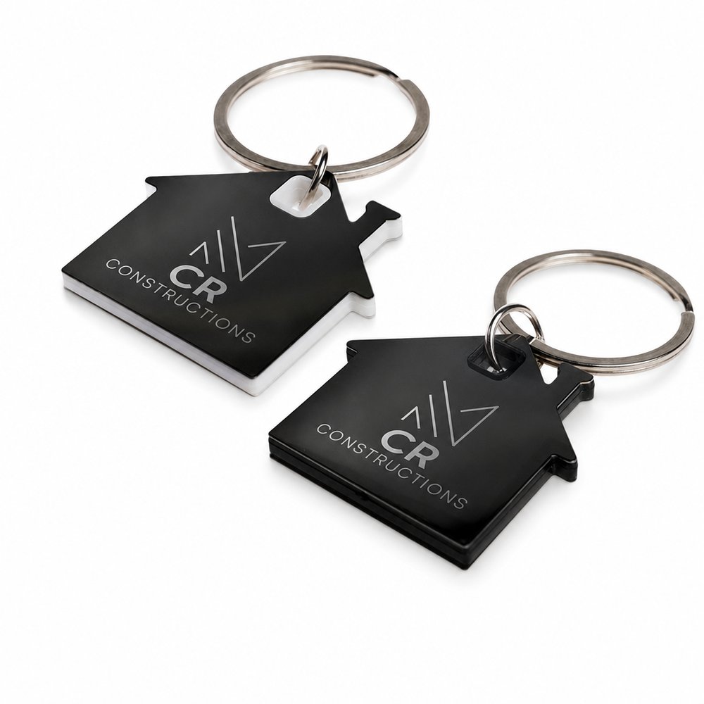
  • House Stainless Steel Keyrings
    House Stainless Steel Keyringsfrom ¥156 税込

    Why it carries the move: a house-shaped key holder = the threshold crossed, the home claimed, belonging made tangible in metal — pairing a heavy, textured metal finish with deeply engraved, widely tracked soft-serif typography.

    First-home buyer → the carpark moment after settlement, threading their new key onto something that finally makes the whole thing feel real.

Three more from the studio

More moments worth a look.

Want something like these?

Ask Findie for a quick conversation, or hand the brief to Susan and the team. Either works.