@monpalette_ (slide 1 of 4)
@monpalette_ (slide 2 of 4)
@monpalette_ (slide 3 of 4)
@monpalette_ (slide 4 of 4)
1 / 4

Brand crush

Brand study

Identity by monpalette_

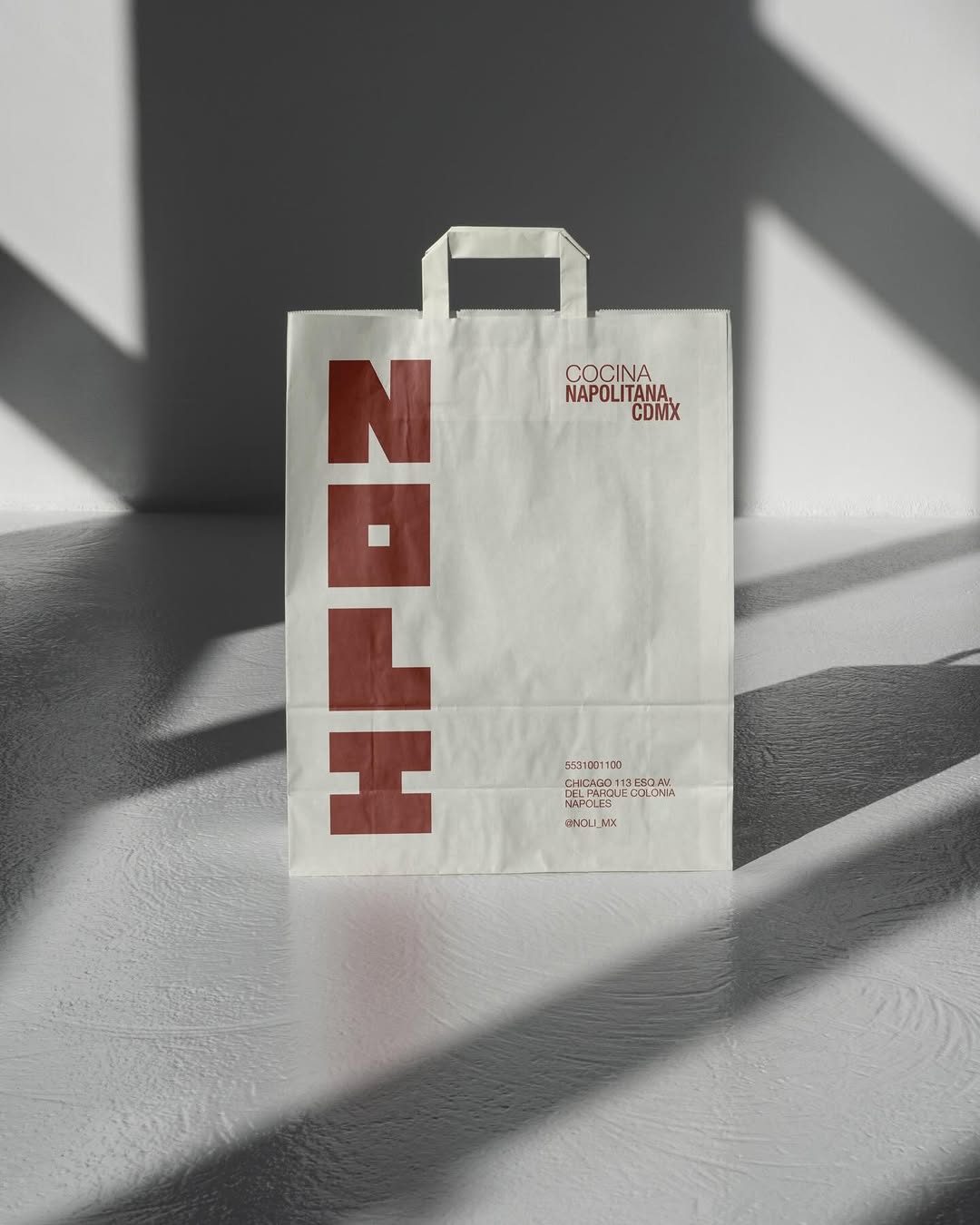
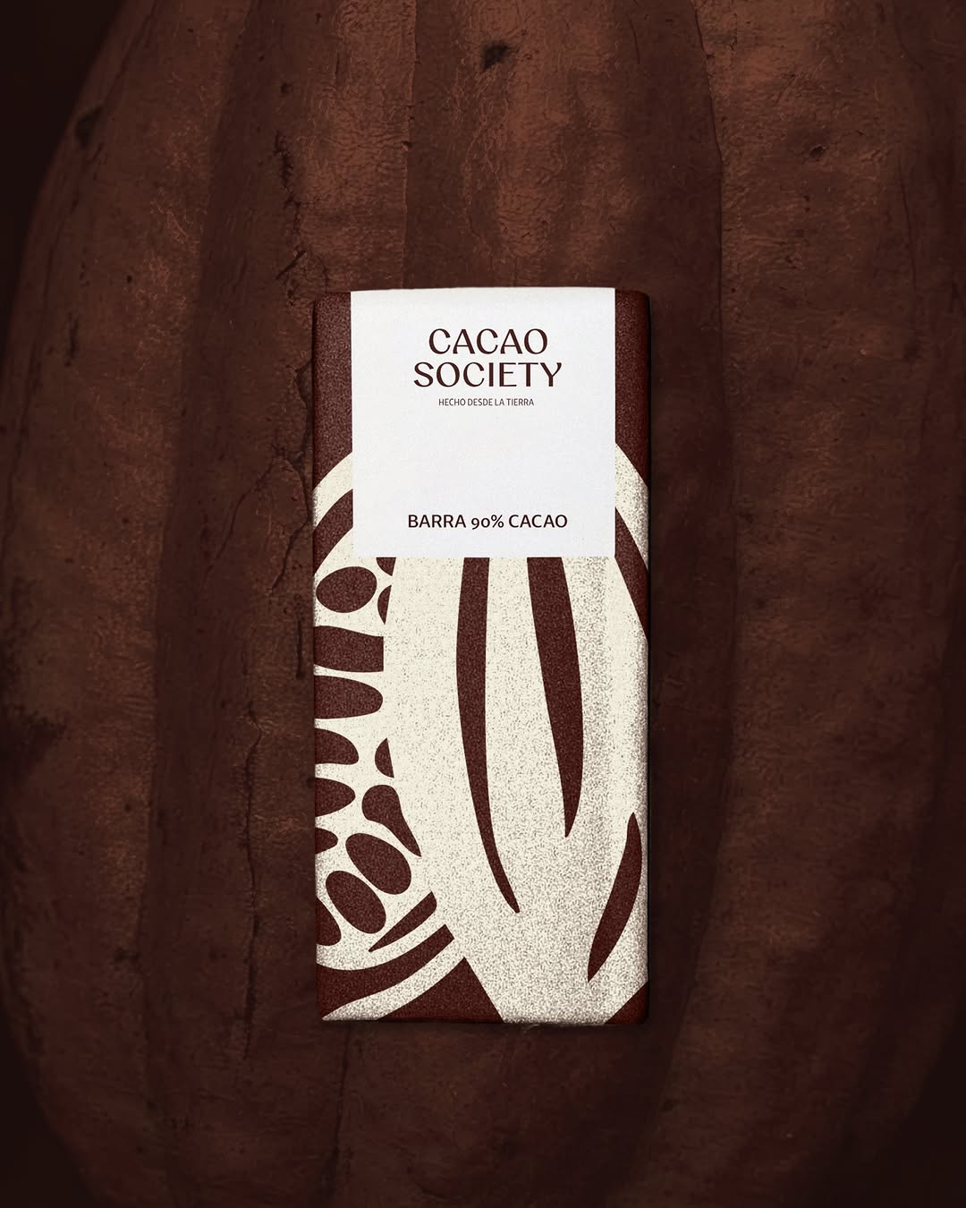
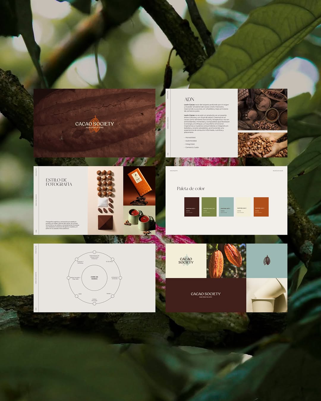
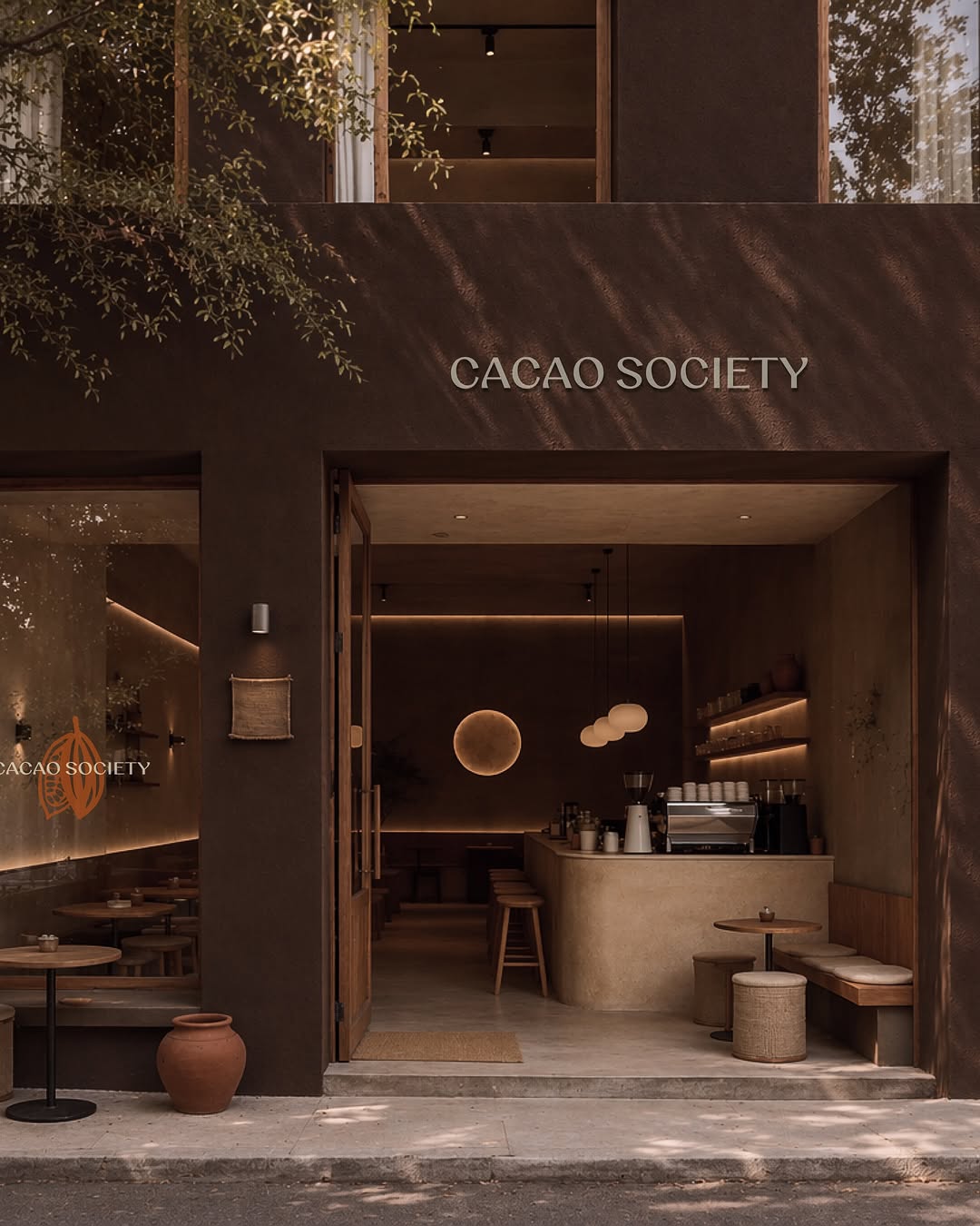
The client asked for 'modern and easy to read' without losing craft credibility — and the answer was an earth palette applied with system discipline: consistent margins, one type family, cacao browns used like a corporate colour. Proof that earthy ≠ folksy. If your brand fears looking 'handmade at a market', this is the fix: keep the palette organic, make the grid ruthless.

2026年5月21日
This identity lives in our Boutique Hotel aesthetic — The feeling of checking into a beautiful hotel. Warm lighting, thoughtful details and products guests remember.

The Brand Move

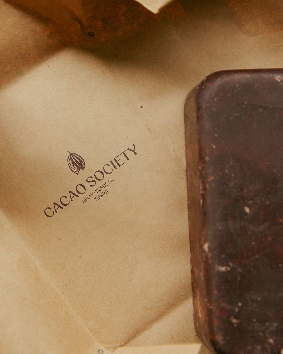
Cacao Society: artisanal without the market-stall clichés

Part of the earth tones aesthetic →

What makes it work

The client asked for 'modern and easy to read' without losing craft credibility — and the answer was an earth palette applied with system discipline: consistent margins, one type family, cacao browns used like a corporate colour. Proof that earthy ≠ folksy. If your brand fears looking 'handmade at a market', this is the fix: keep the palette organic, make the grid ruthless.

What it signals

Reach for earth tones when the brand promise is grounded in something real — ingredients, soil, craft, provenance. They signal patience and substance, which is why they dominate wellness, food provenance and anything farm-to-anywhere. They're also the safest premium move for a brand that can't wear black: warm, credible, never trying too hard.

Apply it to merchandise

This move translates naturally to Skincare & wellness, Specialty food & coffee, Wineries & distilleries, Landscape & garden design, Regenerative agriculture, Interior & ceramic studios, and Eco-tourism.

Who owns this look

  • Aesop:amber glass turned a UV-protection necessity into the most recognisable shelf in retail
  • Le Labo:kraft labels and apothecary type — industrial warmth at luxury pricing
  • Rothy's & Allbirds:made 'undyed' read as a status colour, not an absence of one
  • Grown Alchemist:the Australian proof that botanical can look laboratory-precise

Why it matters now

  • Verified sustainability

    2026 consumers expect certification printed on the object, not claimed in the caption — earth palettes carry that story visually before the fine print.

  • Craft & imperfection

    the anti-AI design wave (visible grain, hand-stamped marks, uneven deboss) lives most comfortably on clay, kraft and stone tones.

  • Quiet luxury crossover

    stealth-wealth fashion pushed taupe, olive and stone into boardrooms — earth tones are now a premium signal, not a rustic one.

The psychology

Why we study brands we admire

Great identities are solved problems you get to inherit for free. Every brand crush in this collection made a decision — about material, restraint, colour, voice — that took them years to land. Studying the decision costs you four minutes and skips the years.

Three more from the studio

More moments worth a look.

Want something like these?

Ask Findie for a quick conversation, or hand the brief to Susan and the team. Either works.