thomasfotomas (slide 1 of 10)
thomasfotomas (slide 2 of 10)
thomasfotomas (slide 3 of 10)
thomasfotomas (slide 4 of 10)
thomasfotomas (slide 5 of 10)
thomasfotomas (slide 6 of 10)
thomasfotomas (slide 7 of 10)
thomasfotomas (slide 8 of 10)
thomasfotomas (slide 9 of 10)
thomasfotomas (slide 10 of 10)
1 / 10

Brand crush

thomasfotomas

Identity by thomasfotomas

gradient-as-negative-spacesunset gradients, high-contrast focal points, quiet confidence

Look at how the aggressive horizontal motion blur flattens the ocean into soft bands of pastel, forcing the sharp silhouette and that high-vis yellow board to command the frame. The contrast between the washed-out background and the crisp, highly saturated focal point does all the heavy lifting for the eye.

The portable idea

You can manufacture focus by washing out your background and letting a single, highly saturated brand asset sit in the middle of it. Pulling a soft, blurred gradient across the bulk of a flat printable surface gives your logo somewhere quiet to land. It is a smart way to use full-colour print without shouting.

2026年5月28日Brand study
Steal this for your brand world

Findie's translation of the move above into specific Sense2 products by industry. Pick the row that fits your brief — pricing is per piece at minimum order quantity.

This identity lives in our Boutique Hotel aesthetic — The feeling of checking into a beautiful hotel. Warm lighting, thoughtful details and products guests remember.

The Brand Move

Manufactured focus: the high-vis board in pastel surf

Part of the coastal australian aesthetic →

What makes it work

Aggressive horizontal motion blur flattens the whole ocean into soft pastel bands — and then one high-vis yellow board snaps the frame into focus. That's a colour strategy, not a photograph: desaturate the world, saturate the one thing you own. On a merch range this is the sun-bleached palette with a single signal colour on the logo hit — everything calm except the thing you want remembered.

What it signals

The coastal palette is Australia's home-ground advantage — sun-bleached, salt-washed, optimistic. Use it when the brand sells ease: hospitality, summer campaigns, anything that wants to feel like knock-off time on a Friday. It reads instantly Australian to international audiences, which makes it export gold.

Apply it to merchandise

This move translates naturally to Tourism & hotels, Surf & swimwear, Craft beverages, Real estate (coastal), Festivals & events, and Banks & telcos going friendly.

Who owns this look

  • Aesop (Sydney stores):proof the coastal light can be done in muted, architectural tones
  • Vacation Inc.:sunscreen that turned 80s poolside nostalgia into a whole identity
  • Sun Bum:owns beachy yellow so hard the bottle IS the brand
  • Salty Captain:Aussie salt-life branding with high-vis confidence

Why it matters now

  • Pantone 2026: Cloud Dancer

    the colour of the year is a lofty, calming white — sun-bleached coastal palettes are exactly on-trend without chasing it.

  • Place-based authenticity

    2026 packaging juries reward cultural provenance; genuine Australian coastal cues beat generic 'beach' clip-art everywhere.

  • Soft-focus photography

    motion blur and haze (see the surf shot below) are replacing crisp lifestyle photography for mood-first brands.

The psychology

Why we study brands we admire

Great identities are solved problems you get to inherit for free. Every brand crush in this collection made a decision — about material, restraint, colour, voice — that took them years to land. Studying the decision costs you four minutes and skips the years.

Apply the move

Carry this into your own merchandise

These products carry the move natively — each one described by its own product intelligence, the same way Findie reasons about it.

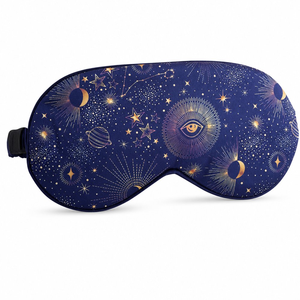
  • Satin Sleeping Masks (Full Colour Print)
    Satin Sleeping Masks (Full Colour Print)from ¥236 税込

    Why it carries the move: a satin sleep mask = drawing the curtain on the day, the permission to switch off and disappear into rest — flooding the satin finish with a sunset gradient leaves the centre completely quiet for a crisp, high-contrast logo drop.

    A frequent flyer in seat 14C → the cabin lights dim, they pull it on, and the day's seventh meeting finally goes quiet at 38,000 feet.

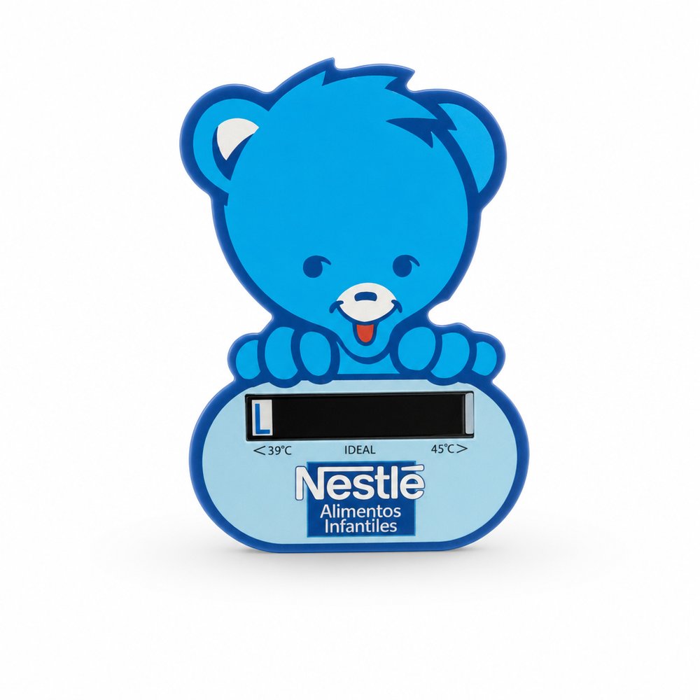
  • Baby Bath Thermometers
    Baby Bath Thermometersfrom ¥149 税込

    Why it carries the move: a baby bath thermometer = the threshold of care — checking it's safe before the moment of trust, the vigilance of a new parent — the soft wash on the plastic casing provides the perfect muted backdrop to contrast with the sharp read of the temperature gauge.

    New mum, three days home from hospital → the 2am bath, exhausted, water swirling — she glances at the little floating face instead of second-guessing her wrist, and exhales.

  • Stickers Vinyl (78x48mm)
    Stickers Vinyl (78x48mm)from ¥107 税込

    Why it carries the move: a sticker = a claimed surface, a small act of belonging stamped wherever you choose — a matte vinyl finish holds gradient banding beautifully without the glare fighting your central focal point.

    A uni student → the late-night dorm decision of which sticker is cool enough to make the laptop lid, then defending the choice to a flatmate.

Three more from the studio

More moments worth a look.

Want something like these?

Ask Findie for a quick conversation, or hand the brief to Susan and the team. Either works.