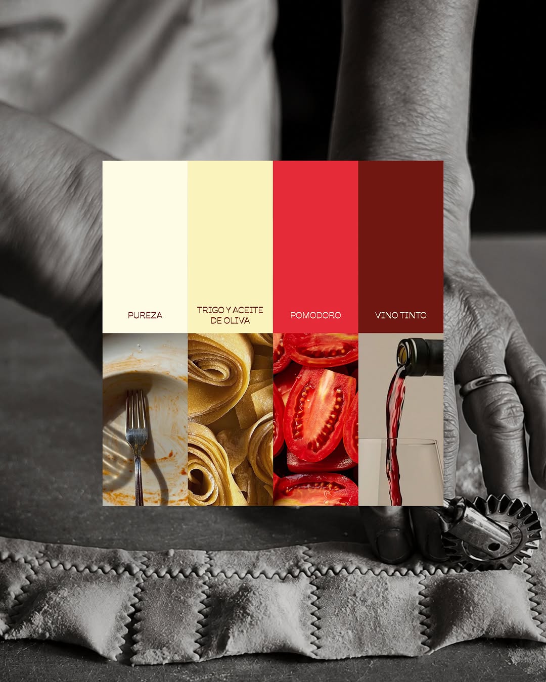
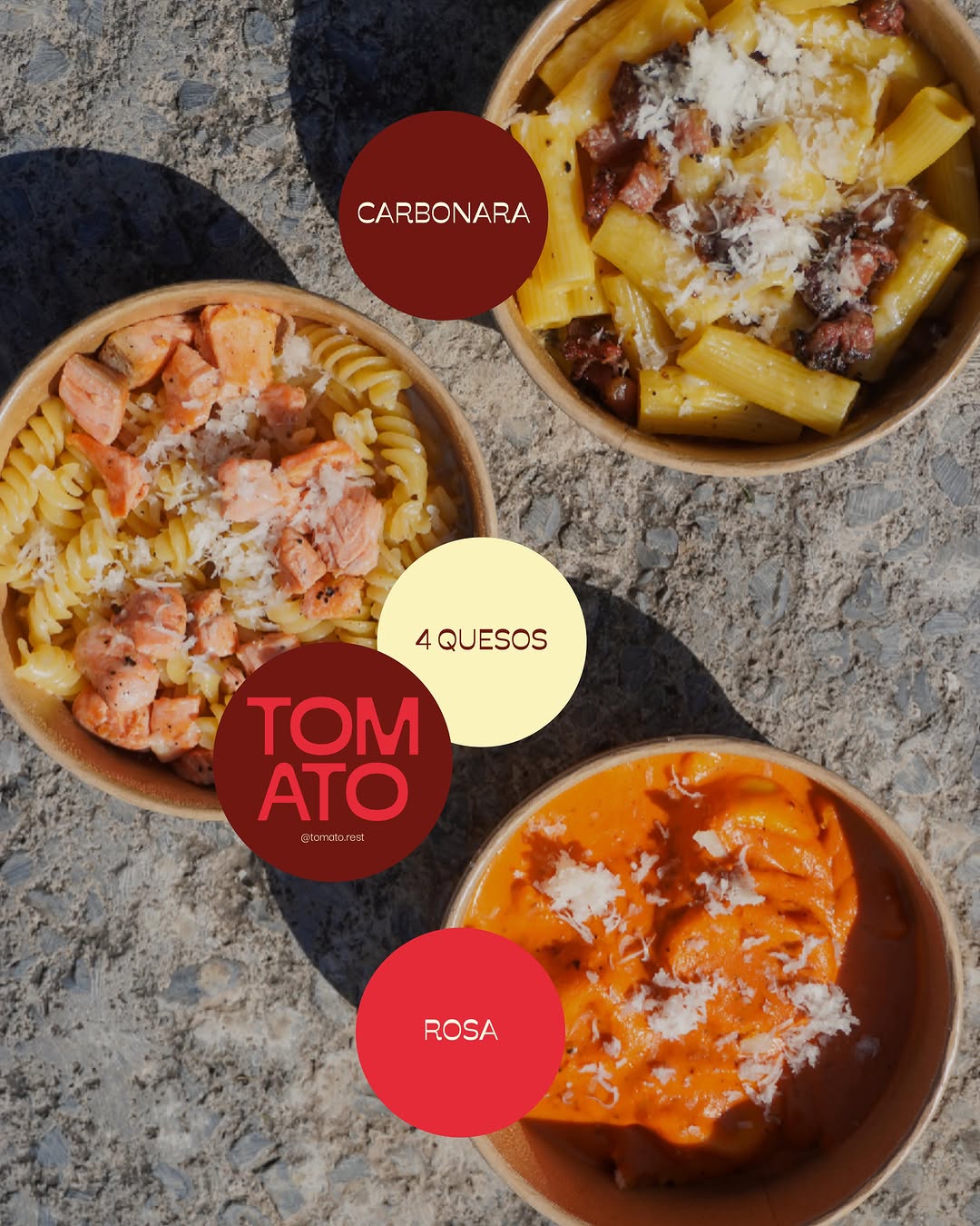
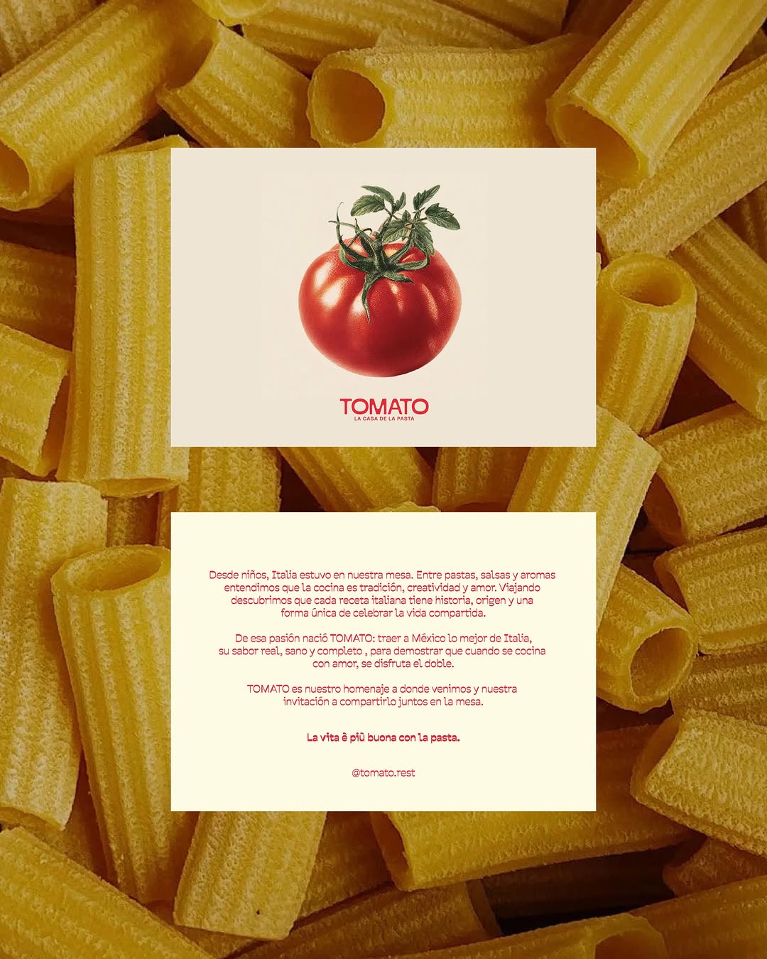
visceral minimalism, raw texture, confident typography (slide 1 of 5)
visceral minimalism, raw texture, confident typography (slide 2 of 5)
visceral minimalism, raw texture, confident typography (slide 3 of 5)
visceral minimalism, raw texture, confident typography (slide 4 of 5)
visceral minimalism, raw texture, confident typography (slide 5 of 5)
1 / 5

Brand crush

Brand study

Identity by uncocostudio

raw-material-as-canvasvisceral minimalism, raw texture, confident typography

Stripping away the packaging to lay a quiet, generously tracked wordmark directly over a hyper-textured macro shot is a deliberate trust play. It signals absolute confidence in the raw material, forcing the viewer's brain to process the sensory weight of the product before it even registers the brand name.

The portable idea

When you have a product this textural, the strongest strategic move is to get out of its way. Dropping a highly disciplined, soft-serif wordmark over a macro crop of your core ingredient shifts the positioning from manufactured good to pure substance. It proves you do not need elaborate packaging structures to hold a premium price point in a crowded market.

2026年5月21日
Steal this for your brand world

Findie's translation of the move above into specific Sense2 products by industry. Pick the row that fits your brief — pricing is per piece at minimum order quantity.

This identity lives in our Boutique Hotel aesthetic — The feeling of checking into a beautiful hotel. Warm lighting, thoughtful details and products guests remember.

The Brand Move

Unococo Studio: a wordmark laid bare on raw texture

Part of the boutique hotel aesthetic →

What makes it work

Unococo Studio stripped the packaging away and set a quiet, generously tracked wordmark directly over a hyper-textured macro shot. Raw-material-as-canvas is a trust play, it signals absolute confidence in the substance and makes the eye read texture and name as one. That composure is pure boutique-hotel: nothing hidden, nothing oversold. For premium gifting it argues for letting the material be the hero and the mark be a light touch on top, type printed straight onto the object, no sleeve, no shroud. When a brand shows you the raw thing and signs it simply, the confidence is contagious, and confidence is the most expensive note a gift can hit.

What it signals

Boutique hotel is the aesthetic of considered hospitality — amber light, brass, cream linen, the feeling of being expected. Use it for gifts that should feel like a stay somewhere expensive: client welcomes, settlements, VIP events. It flatters the recipient rather than promoting the sender, which is exactly why it works.

Apply it to merchandise

This move translates naturally to Hotels & venues, Property developers, Private banking & wealth, Law & advisory firms, Airlines (premium cabins), and Wedding & event planners.

Who owns this look

  • Aman & Soho House:the template: monogram restraint, materials over marks
  • Aesop (amenities):the hotel-bathroom flex that upgraded an entire industry's amenity thinking
  • The Hoxton:warm mid-century hospitality branding that travels city to city
  • Halcyon House (Cabarita):Australia's coastal take on boutique-hotel identity

Why it matters now

  • Lightweight luxury

    2026's luxury packaging is shedding weight — premium now means considered materials and closures, not heavy boxes. Perfect for hotel-grade gifting.

  • Refillable prestige

    aluminium and refill systems are the new premium amenity standard — sustainability as a luxury feature, not a compromise.

  • Monogram revival

    quiet-luxury fashion brought back the small woven monogram; hotel-style gifts with initials-not-logos feel personal and expensive.

The psychology

Why we study brands we admire

Great identities are solved problems you get to inherit for free. Every brand crush in this collection made a decision — about material, restraint, colour, voice — that took them years to land. Studying the decision costs you four minutes and skips the years.

Apply the move

Carry this into your own merchandise

These products carry the move natively — each one described by its own product intelligence, the same way Findie reasons about it.

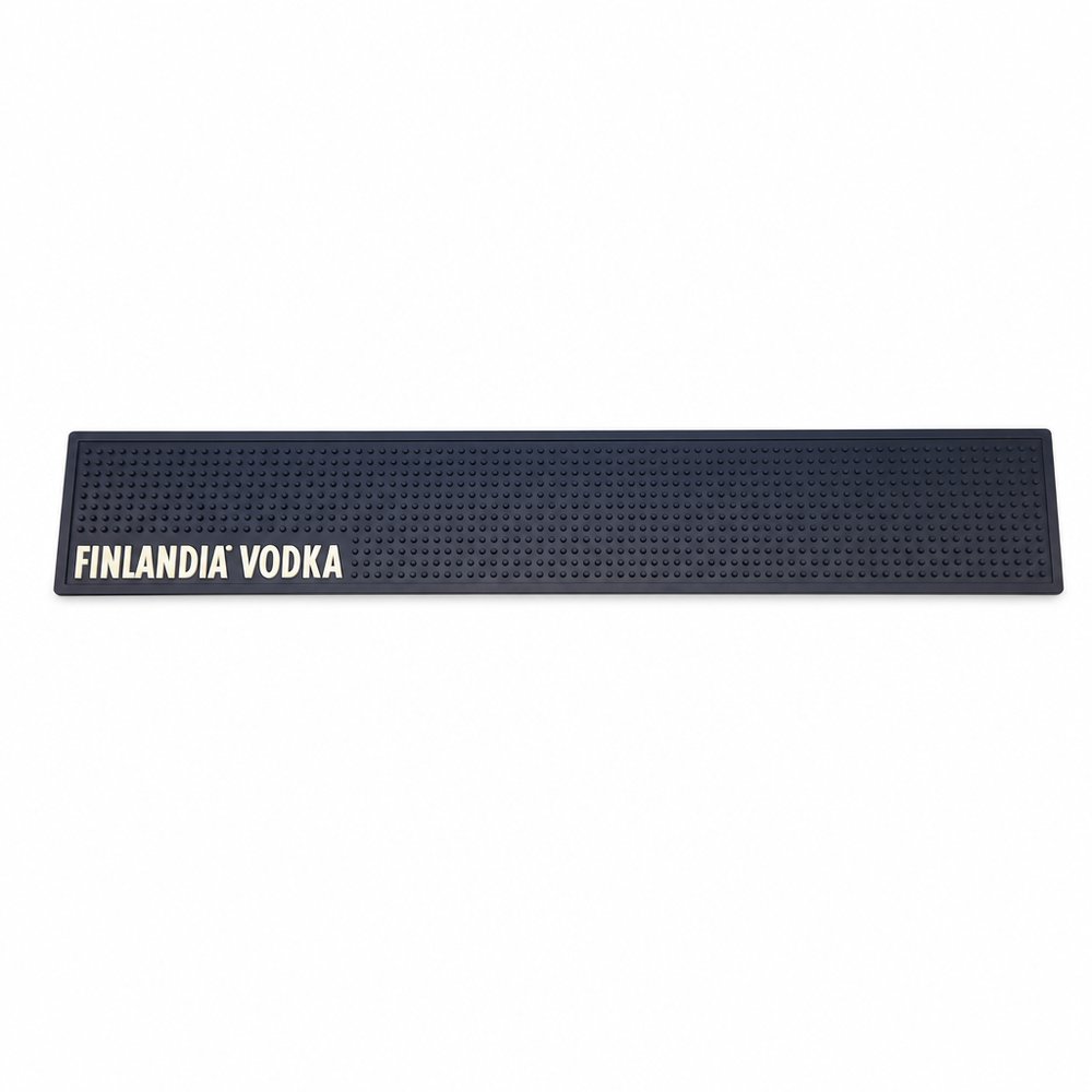
  • Bar Mats (Rubber)
    Bar Mats (Rubber)from ¥1,846 税込

    Why it carries the move: a bar mat = the claimed surface, the place where your name owns the counter where people gather and pour — floods the textured rubber base with a macro food print, leaving just a quiet logo in the corner to anchor the design.

    A bartender at 1am during a power-dip → the glow print is the only thing they can see, and the brand becomes the thing that kept the pours flowing.

  • Rice Crackers (20g)
    Rice Crackers (20g)from ¥318 税込

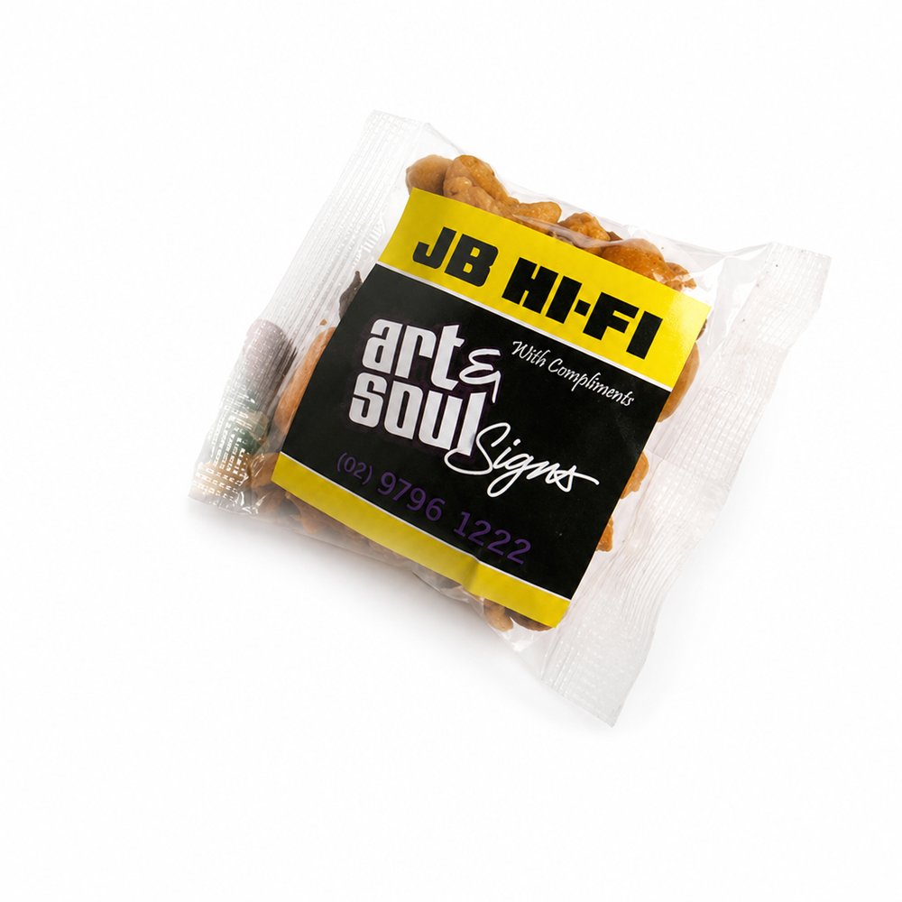
    Why it carries the move: a small savoury handful = the shared snack that keeps a long room going, sustaining people through the in-between moments — transparent packaging lets the physical texture of the rice cracker serve as the background for a sharp, minimal sticker.

    An open-home visitor → standing in an unfamiliar kitchen, peeling open the pack and suddenly picturing weeknight dinners in this exact room.

  • Refresher Towel Sachets
    Refresher Towel Sachetsfrom ¥17 税込

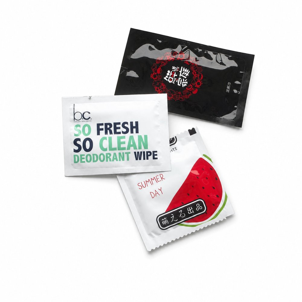
    Why it carries the move: a refresher towel = the reset moment — wiping away the mess so you can begin again clean — a matte sachet printed with a macro shot of the active botanical ingredient, acting as a tactile preview before tearing.

    A diner mid-way through a messy seafood boil → that exhale of relief when sauce-coated fingers come clean and they reach for the wine without smearing the glass.

Three more from the studio

More moments worth a look.

Want something like these?

Ask Findie for a quick conversation, or hand the brief to Susan and the team. Either works.