welovebranding (slide 1 of 10)
welovebranding (slide 2 of 10)
welovebranding (slide 3 of 10)
welovebranding (slide 4 of 10)
welovebranding (slide 5 of 10)
welovebranding (slide 6 of 10)
welovebranding (slide 7 of 10)
welovebranding (slide 8 of 10)
welovebranding (slide 9 of 10)
welovebranding (slide 10 of 10)
1 / 10

Brand crush

welovebranding

Identity by welovebranding

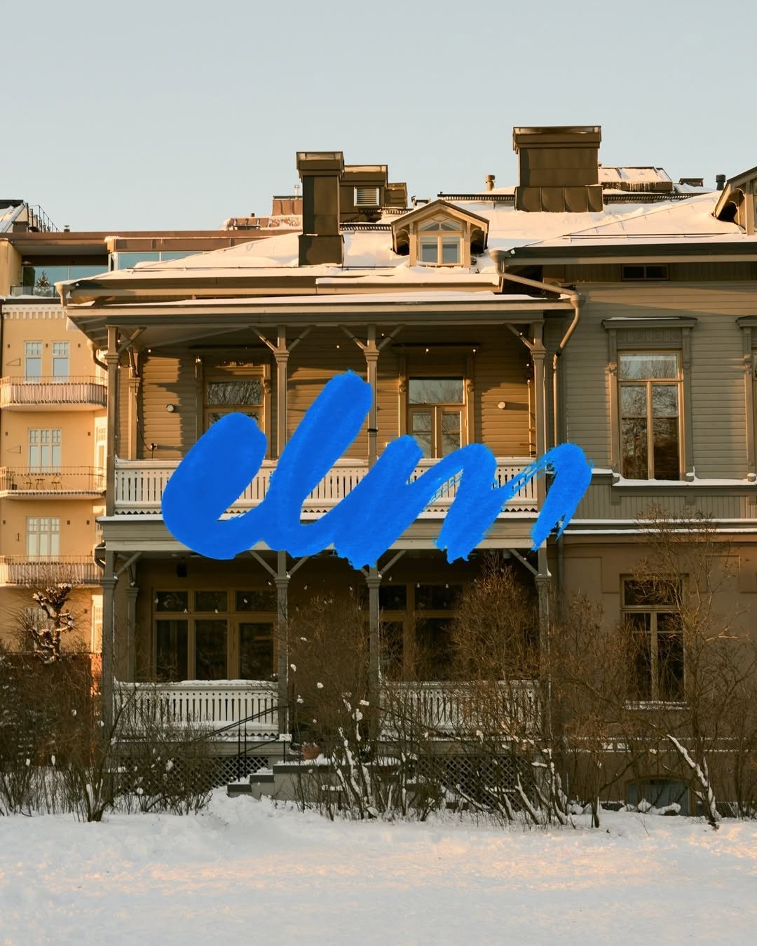
architectural-scale-contrastbold intervention, traditional meets brutalist colour, high contrast

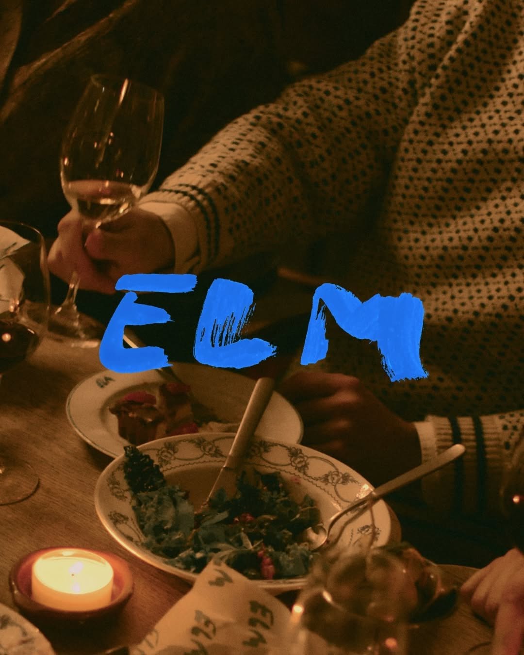
That thick, wet-brush cobalt blue heavily layered over the muted, snow-dusted timber facade creates immediate friction. The sheer scale and texture of the mark acts as a physical intervention, completely disregarding the architectural grid behind it.

The portable idea

Looking at how that raw, oversized brushstroke overpowers the heritage facade makes you rethink the need for subtlety. You do not always have to blend a brand into its surroundings to make it feel permanent. Sometimes the strongest move is an unapologetic, high-contrast mark scaled up until it becomes the environment.

2026年5月22日Brand study
Steal this for your brand world

Findie's translation of the move above into specific Sense2 products by industry. Pick the row that fits your brief — pricing is per piece at minimum order quantity.

This identity lives in our Boutique Hotel aesthetic — The feeling of checking into a beautiful hotel. Warm lighting, thoughtful details and products guests remember.

The Brand Move

Cobalt on snow-dusted timber: the arrival moment

Part of the boutique hotel aesthetic →

What makes it work

A thick wet-brush cobalt mark painted across a muted timber facade — the scale and texture make the sign a physical event, not a label. Hotels understand arrival theatre; the identity begins at the door. For events and gifting, this is the oversized ribbon, the painted crate, the entrance moment that photographs itself.

What it signals

Boutique hotel is the aesthetic of considered hospitality — amber light, brass, cream linen, the feeling of being expected. Use it for gifts that should feel like a stay somewhere expensive: client welcomes, settlements, VIP events. It flatters the recipient rather than promoting the sender, which is exactly why it works.

Apply it to merchandise

This move translates naturally to Hotels & venues, Property developers, Private banking & wealth, Law & advisory firms, Airlines (premium cabins), and Wedding & event planners.

Who owns this look

  • Aman & Soho House:the template: monogram restraint, materials over marks
  • Aesop (amenities):the hotel-bathroom flex that upgraded an entire industry's amenity thinking
  • The Hoxton:warm mid-century hospitality branding that travels city to city
  • Halcyon House (Cabarita):Australia's coastal take on boutique-hotel identity

Why it matters now

  • Lightweight luxury

    2026's luxury packaging is shedding weight — premium now means considered materials and closures, not heavy boxes. Perfect for hotel-grade gifting.

  • Refillable prestige

    aluminium and refill systems are the new premium amenity standard — sustainability as a luxury feature, not a compromise.

  • Monogram revival

    quiet-luxury fashion brought back the small woven monogram; hotel-style gifts with initials-not-logos feel personal and expensive.

The psychology

Why we study brands we admire

Great identities are solved problems you get to inherit for free. Every brand crush in this collection made a decision — about material, restraint, colour, voice — that took them years to land. Studying the decision costs you four minutes and skips the years.

Apply the move

Carry this into your own merchandise

These products carry the move natively — each one described by its own product intelligence, the same way Findie reasons about it.

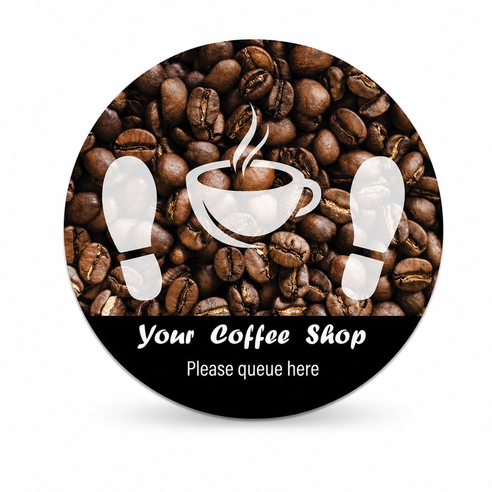
  • Floor Decal Stickers (Various Sizes)
    Floor Decal Stickers (Various Sizes)from ¥569 税込

    Why it carries the move: a floor decal = a directional mark on shared ground — it points, claims space, and says 'this way, you belong here' — scales to architectural dimensions to violently disrupt a quiet, traditional lobby floor.

    A store manager on opening morning → peeling one down and seeing the queue self-organise without a single 'please line up here' sign, the floor doing the work for them.

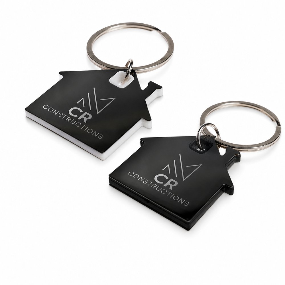
  • House Stainless Steel Keyrings
    House Stainless Steel Keyringsfrom ¥157 税込

    Why it carries the move: a house-shaped key holder = the threshold crossed, the home claimed, belonging made tangible in metal — a rigid, traditional metal shape that can anchor a single, unapologetic bright ink fill.

    First-home buyer → the carpark moment after settlement, threading their new key onto something that finally makes the whole thing feel real.

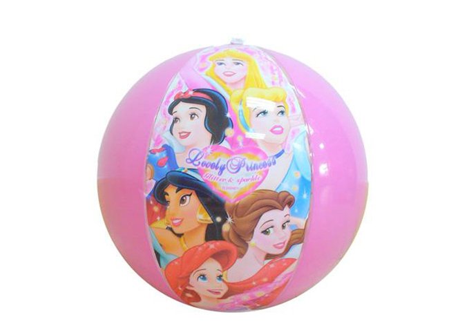
  • Full Colour Printed Beach Balls (30cm)
    Full Colour Printed Beach Balls (30cm)from ¥580 税込

    Why it carries the move: a beach ball = summer permission — the inflatable cue that says the rules are off and play is on — an oversized, disruptive canvas for a massive wordmark at an outdoor festival or courtyard.

    A resort guest's kid → the second they spot it in the room and the whole family knows the holiday has officially started before anyone's unpacked.

Three more from the studio

More moments worth a look.

Want something like these?

Ask Findie for a quick conversation, or hand the brief to Susan and the team. Either works.