


扇風機
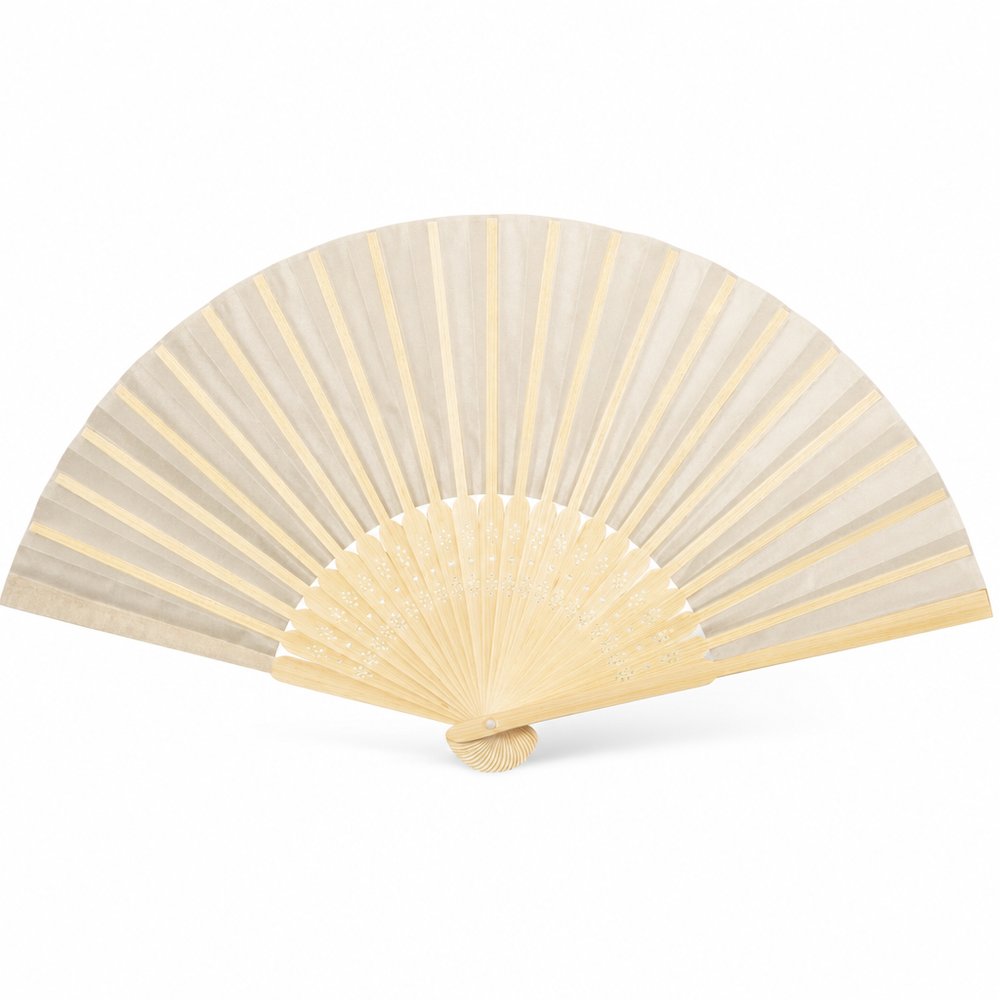
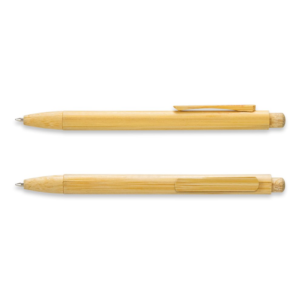
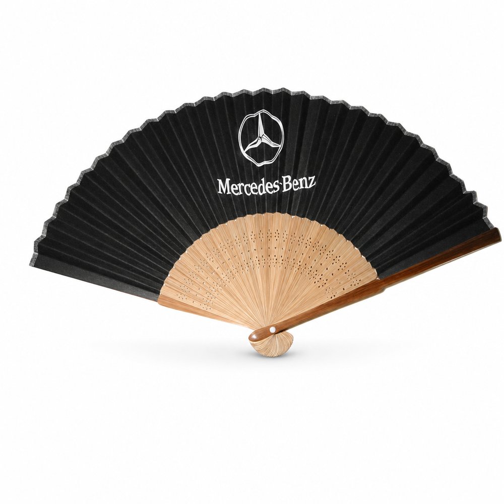
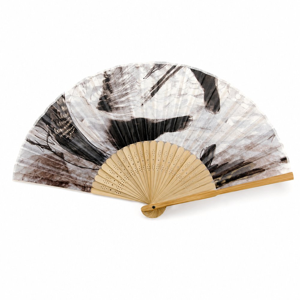
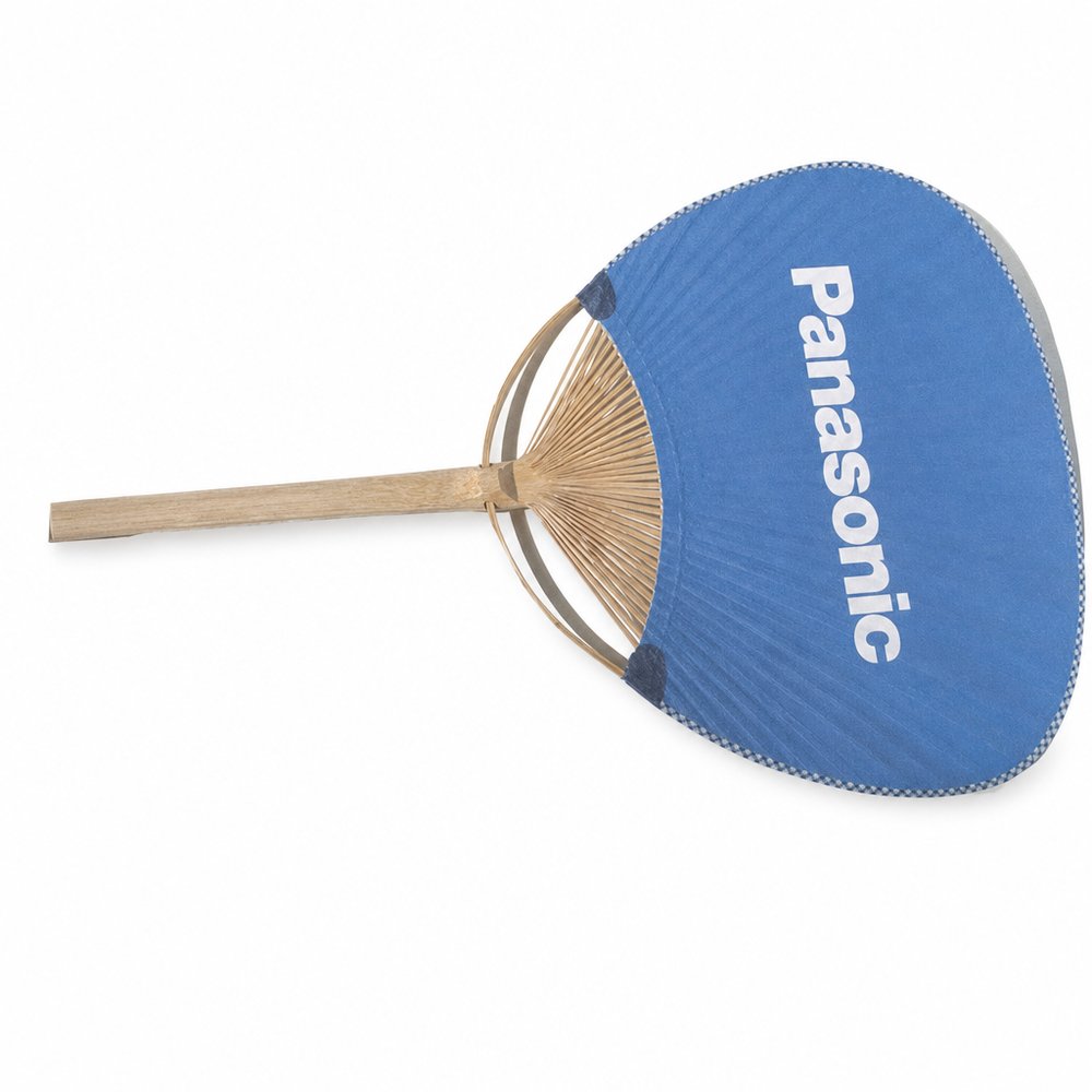
木製うちわ
〜 ¥334 税別最小ロット 5000
見つける それ。 愛する それ。 keep それ。
Honest materials. Useful objects. Nothing unnecessary.
Think: MUJI · Snow Peak · Aman KyotoSee the hand-picked edit →
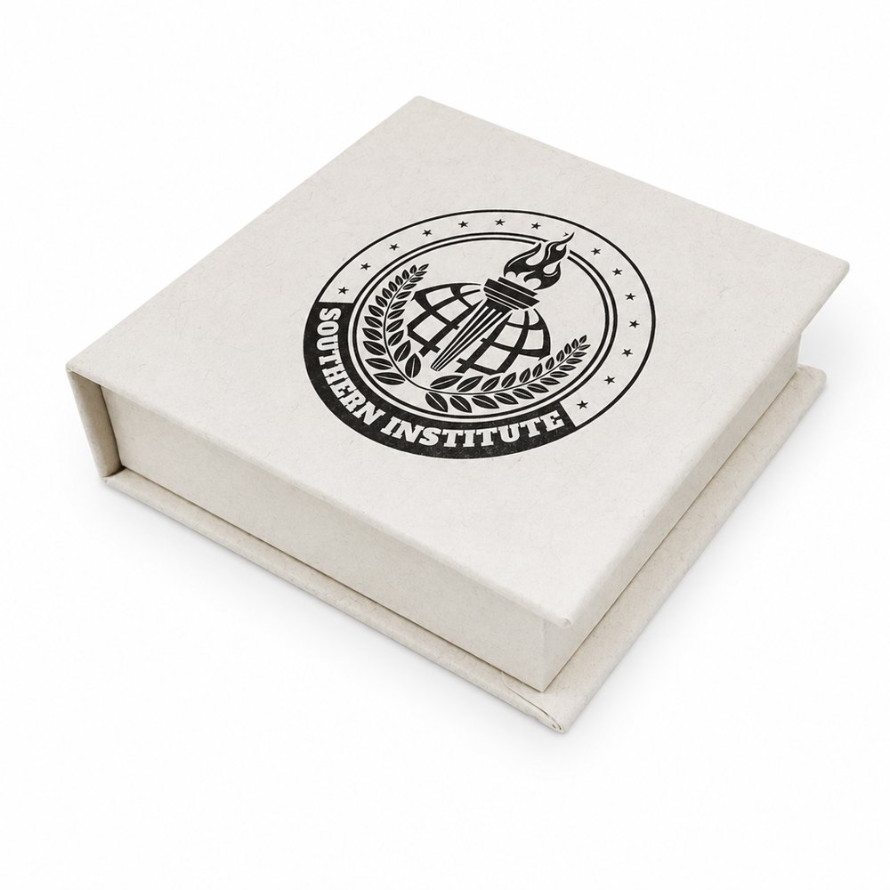
Soft serifs, generous spacing, one quiet colour — this wordmark does the heavy lifting before a single customer walks in. That's the Japanese-simplicity thesis: the identity should lower the room's pulse. For gifting, the parallel is the unboxing — plain washi wrap and a small stamped mark set the same expectation a good storefront does.
Read the full study →Circular debossing sunk into a brushed metal cap forces physical interaction — the fingers find the brand before the eyes do. Sinking type into material signals permanence; printing on top would say the opposite. The curved layout following the cap's geometry is the detail to steal: branding that obeys the object's form always feels inevitable, never applied.
Read the full study →